Saturday, April 22, 2006

From the three-for-a-dollar box

There was a neighborhood-wide garage sale event in my old stomping grounds up on the Ridge today, so I went up to look for some house stuff and discovered a guy selling comics from a bunch of boxes (not collector boxes, just cardboard boxes) on his deck. For the first time in a long time, this kind of opportunity actually included titles I wanted! Here's a selection of the fistful of appealing issues that I found among the dross of mutants, grim 'n' gritty vigilantes, and pneumatic hyper-babes and bought for 33 1/3 cents each:


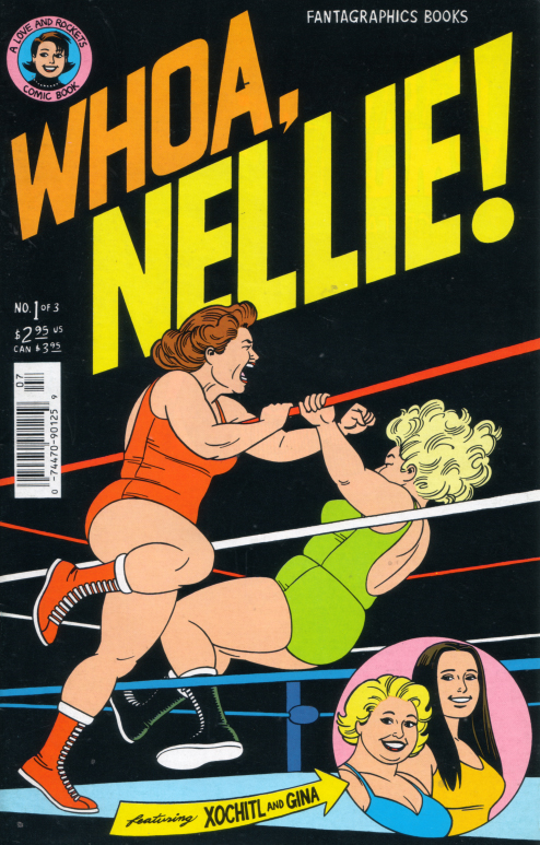
Whoa, Nellie #1 (1996, Fantagraphics). I think that Jaime Hernandez's Archie-inspired art is just beautiful, and I do love me my Love and Rockets, especially Mechanics. Besides, what says excitement better than ass-kicking, middle-aged zaftig lady wrestlers? Not much, in my book!


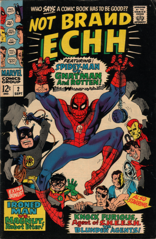
Not Brand Ecch #2 (1967, Leading Magazine Corp.)[ yeah, that's what the indicia says]. This is a wonderful historical artifact. Not only does it have a cool indicia, it parodies Batman at the height of his TV popularity, takes on characters such as Magnus and T.H.U.N.D.E.R. from other publishers, and even includes caricatures of Napoleon Solo and Ilya Kuryakin. Much of the art is by Marie Severin, a much-underrated talent (who also happened to live in my old neighborhood in Brooklyn).


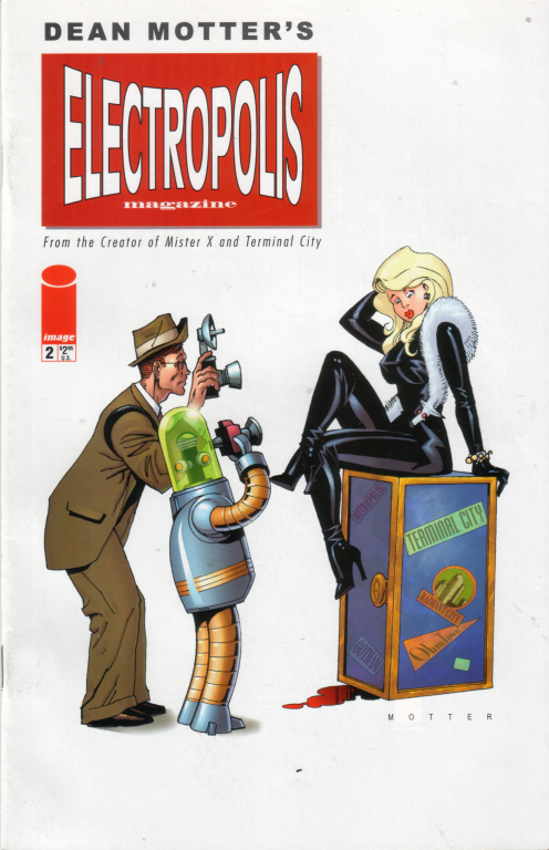
Electropolis Numbers 1 and 2 (Image, 2001). I'm not really sure what this is, but it has flying cars with fifties tailfins, cigar-smoking robots who wear porkpie hats, and zeppelins - who could say no? It's by Dean Motter, the fellow whose Mister X I have read some of and liked a little, but it put me in mind of The Blue Lily, an unfinished work by Angus McKie that I really dug, and that's probably why I got it. (I bought both issues but thought this one had a better cover.)


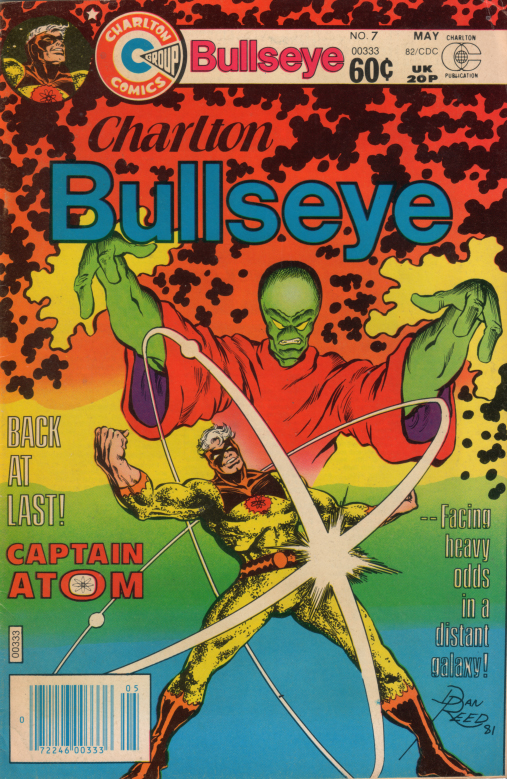
Charlton Bullseye No. 7 (1982, Charlton Publications). I got this to see if it could possibly be as crappy as Charlton Bullseye No. 1, featuring the Blue Beetle and The Question, which has remained in the Shortbox by accident, and which is one of the worst "professional" comics I have ever seen. If this book is even close to being that horrible, Captain Atom hasn't got a prayer despite his snazzy, old-school yellow outfit. Since there is a Nightshade back-up feature from Bill Black, my hopes for the captain are not high.


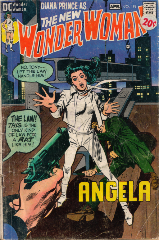
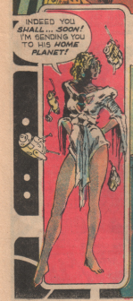
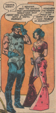
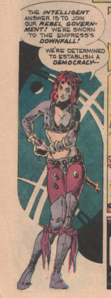
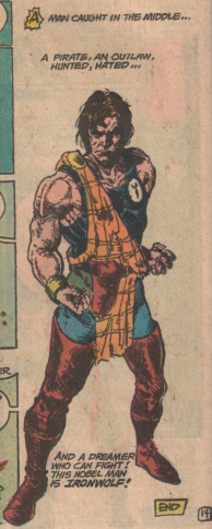
Starfire No. 1 (1976, National Periodical Publications). Here's a little piece of the DC Explosion, ladies and gentlemen, and we'll see if it shows whether the talent in the issue really was stretched a little too thin during this period - what's your guess? And I just have to say that our heroine's one-legged, green-giraffe skin cutaway unitard is not the most outrageous outfit in this Barsoom-esque story - I will post about this just to show the martial-artist-cum-priest's doublet and slouch hat ensemble.


Captain Action No. 3 (1969, NPP). Okay, I bought this one just for the "I had that!" factor. Not only did I have this comic when it first came out, and not only did I have a Captain Action doll (I don't think we called them action figures then), I also had a Dr. Evil doll (we're not talking the Mike Meyers character here). Plus, this issue has some cool artwork by Gil Kane, inked by maybe Mike Abel, although some panels look a lot like Wally Wood.


Machine Man Numbers 1 through 4 (1984, Marvel Comics Group). I don't know too much about this character - I think he was spun off from Jack Kirby's version of 2001: A Space Odyssey and then became part of the mainstream Marvel universe. All four parts of this mini-series are here, so maybe this will clue me in. I have always liked the look of the character, anyway.


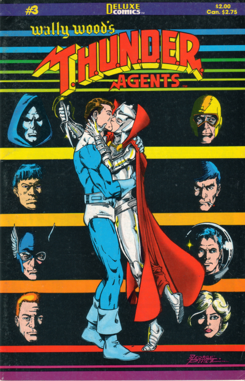
Wally Wood's T.H.U.N.D.E.R Agents No. 3 (1985, Deluxe Comics). I can't recall (or never knew) the backstory of Deluxe and how they were related to Wally Wood or his estate, but I do remember this revival of Dynamo, Lightning, Raven, Noman and the rest as being fairly competent. This issue contains a main story by Dave Cockrum (with inks by Murphy Anderson ?!), a Keith Giffen Lightning story, and Noman solo penciled by Steve Ditko (although in most panels his art is completely overwhelmed by the pedestrian inks of Greg Theakston).


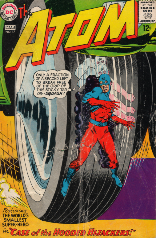
The Atom No. 17 (1965, NPP). And saving the best for last: this is solid silver, folks. Gardner Fox story, Kane & Greene art, non-psycho Jean Loring, the Atom traveling by telephone wire, letters to the editor with home addresses printed -- all this, and a backup story featuring a special guest appearance by Jules Verne! (Sound Cue: Those Were the Days, My Friend by Mary Hopkins)

Next week: Back to the insides of some comics.

Sunday, April 16, 2006

Of Amazons and Greeks

A day or so late, but here's some bits:

First of all, a cover from perhaps my all-time favorite series, Diana Prince as the New Wonder Woman:


There are resources aplenty on this phase of the Amazing Amazon's history, during which she was a Diana Rigg/Emma Peel clone for a few years. It has become just another almost-forgotten episode of an increasinging disjointed retcon-tinuity, and when I have something new and insightful to say about it, I will do so. In the meantime, looking through the issues I have from this period, I thought this might be of interest:


Of course, the letters page is cool in that retro, weren't-fans-so-cute- before-the-internet way, but it is the Statement of Ownership, Management and Circulation that I really liked. Not only is is just totally old school (I don't think DC should ever have changed its name from National Periodical Publications) but look at the sales figures and consider this:

This lame title, in the midst of an ill-considered (and ultimately failed) experiment that tinkered with one of the top three iconic figures of the publisher, in the middle of disruptive changes to its creative and editorial teams, in a time (1971) before direct markets and with only a nascent "fandom" community, was selling more copies than Infinite Crisis, arguably the most hyped, covered, and discussed comic book ever, is selling now.

I'm just saying.

On a sort of related note, although it is hard for me to imagine that anyone regularly visits here who does not read the Absorbascon, but in case there is, go read Scipio's post on Age of Bronze, to which I can only add, "Yeah, what he said!"

PS: Observant visitors may have noticed some little changes to the site. Of late, I am in the middle of preparing to teach a class in the rhetoric of comics; I have worked on a pilot for that class in a library presentation on How to Read a Graphic Novel; I have, in addition to my research and lesson planning, recently read Men of Tomorrow and Kavalier & Clay; and I have recently subscribed to a listserv for comics scholars. All of this has made me a little ambiguous (and ambivalent) about my relationship with comix right now, so aome things may change around here as a result.

Friday, April 07, 2006

The Empire Galaktika

Today, let's look at a space opera from the nineteen-seventies, chock full of a galactic empire, rebellion, swordplay, blasters, aliens, an imperial legion, and heroism. No, it's not Star Wars - it's the saga of Lord Iron-Wolf, as told in its entirety (sort of) in the pages of three issues of Weird Worlds:


WEIRD WORLDS PRESENTS IRONWOLF
Nov-Dec 1973, Jan-Feb 1974, Oct-Nov 1974
Created, plotted and drawn by Howard Chaykin
Scripts by Denny O'Neil
Covers by Howard Chaykin, Nick Cardy, and Mike Kaluta


This is an outer space adventure typical of its time: in some distant future, the principled hero, Lord Iron-Wolf (yes, hyphenated in the dialogue but not in the title), renounces his priviliged position in the Empire Galaktika in opposition to the Empress's policies and cruelties. He become first an outlaw and then a revolutionary, and escapades in a tradition unbroken from Robin Hood through Zorro to Flash Gordon ensue.

The plot just starts rolling along from the very first page, whipped along by dialogue such as "Control yourself, Lord Iron-Wolf! You may be my best officer but I can still discipline you!" that shoehorned exposition into conversation, and captions such as "At that moment, a mime troupe hired to amuse the court enters, and..." that eliminated any need for those slow, set-up scenes. Ah, they don't write 'em like that anymore.

Howard Chaykin, in both story and art, envisioned a captivating world: Iron-Wolf dresses like Macbeth and talks like Horatio Hornblower; the Empress consorts with hulking aliens reminiscent of oversized Kazakhs and has a praetorian guard of vampires; illegal drugs turn people into supercharged, aggressive brutes. But the crown jewel of Chaykin's conceits was his splendid twist on space-travel technology: starships made of anti-gravity wood!


I still marvel at the audacity and visual appeal of this notion.
Italic
Since this epic does predate Star Wars, it remains firmly in the Buck Rogers tradition when it come to personal technology: although the characters carry ray guns, they also fight with plain old edged swords, rather than with light sabers or solar scimitars or plasma foils or atomic epees or any other sort of non-trademarked energy weapon. Chaykin uses an interesting device in portraying the action scenes: in addition to the usual set-piece fight scenes, we are treated to several little mini-conflicts, shown in triptych in one tier of borderless panels. This set-up is repeated so often it takes on a ritual nature, almost like something from kabuki theatre. Here's a sampling:


Since this is Chaykin, there are several prominent women characters, all of whom display both strength and sexuality, often in a confounding combination. And in this case, all of them wear that odd fashion that marked the transition from the hippie-influenced sixties to the disco-seventies. We have the villian of the piece, the Empress Erika Klein-Hernandez:


There's Missy, she of the aforementioned mime troupe, who becomes an associate of Iron-Wolf's:


And of course, the intriguingly named Shebaba O'Neal, the revolutionary:


Chaykin is working here before his arc of Scorpion (Atlas), Dominic Fortune (Marvel) and American Flagg (First). His art is more baroque and less streamiled, but a lot of the elements that he would continue to play with over the next ten years are in place. (Walt Simonson did some of the lettering, and his streamlined sound effects are jarringly incongruous at times.)

Sad to say, Lord Iron-Wolf never got much more than an introduction; the series - indeed, the whole comic - was cancelled with issue #10, a dream deferred.


Additional notes:

Chaykin and John Francis Moore reworked these themes and characters in the 1992 graphic novel Ironwolf - Fires of the Revolution. The new story, wonderfully illustrated by Mike Mignola and P. Craig Russel with achingly idiosyncratic detail, was more steampunk than space opera (extrapliting even further with the wooden spaceships) and got the usual nineties grim-n-gritty treatment (though not so much as Twilight, the science-fiction magnum opus from which it was spun off).

In the text page for issue #8, Denny O'Neil draws a comparision between the corruption in the Empire Galaktika and the revelations of the Watergate scandal of the Nixon White House, which were just beginning to come to light at the time.

In the text page for issue #10, O'Neil sums up the cancellation in the word ecology. He says they couldn't get enough paper to publish it.

Issues #9 and #10 each contain a back-up feature, Tales of the House of Iron Wolf. The stories concern two brothers, who are the ancestors of both Iron-Wolf and the Empress, in quasi-medieval adventures suposed set 2,000 earlier than the main story, but still in the distant future.

Issue #9 includes an in-story performance of Hamlet, and carries the credit, after Chaykin's and O'Neil's, "With Additional Dialogue by Wm. Shakespeare". (This has become a bit of an in-joke with Shakespearean adaptations.)