Monday, November 26, 2007
Twelve-step review: Samurai: Heaven and Earth
Samurai: Heaven and Earth
by Ron Marz, Luke Ross, Jason Keith, and Dave Lanphear
Dark Horse: 2006
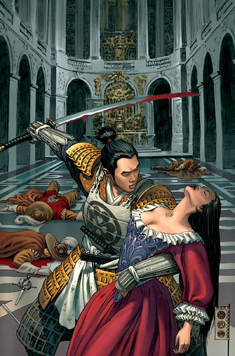
1. Shiro, a samurai in 1704 Japan, loses his beloved Yoshi during the final battle between his master and Chinese warlord. Finding she has been abducted, he follows her trail first to China, and then westward along the Silk Road, eventually finding her in France, at Versailles, in the Court of Louis XIV. Adventures, of course, ensue as he attempts to reunite with her.
2. Yojimbo Meets the Three Musketeers is such an inherently cool high concept that I can forgive the historical inaccuracy of placing the story eighty years after the heyday of Dumas's heroes, one Louis later, and yet still featuring the famous quartet.
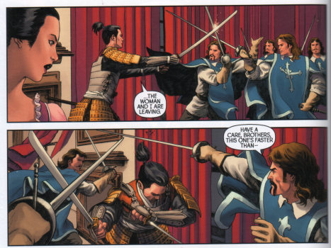
3. While the French swordsmen are not named, in dialog and affect they are clearly Athos, Porthos, Aramis, and D'Artagnan. It is actually my third-favorite realization of the characters, after Dumas's own and the 1973 Richard Lester film.
4. Ron Marz's script is engaging, merging classic tropes and fresh ideas seamlessly. His dialog varies between old-movie formality (not a bad thing) and real-sounding naturalism a little less smoothly, however.
5. One small sticking point in the story is Shiro's preternatural ability to learn languages, which is never adequately addressed or given background. We just have to accept it, and since the story won't work unless the protagonist can speak French, we sort of just do.
6. A bigger flaw in the plot is the apparent maintenance of Yoshi's virtue throughout her abduction. We know she is not a virgin even at the beginning of the story, so the "keeping her unsullied to maintain her high value" trope is out; without it, it would be hard to imagine her not being sexually abused, given her circumstances, no matter how "disagreeable" she is to her captors. And since the love between Yoshi and Shiro is what drives him to cross Heaven and Earth for her, it's hard to imagine this aspect would not come up, but the book basically asks us to ignore it. And, once again, in the moment, we sort of just do.
7. Luke Ross's art is just gorgeous: his set pieces, landscapes, and establishing shots are are like museum-quality oil paintings, but he's not afraid to get "comicky" and use technique to advance the story. His attention to detail might be responsible for sucking some of the dynamism out of his action sequences at times. Jason Keith's colors are wonderfully rich and textured and complement the graphics nicely.
8. One technique that Ross used involved a two-page sequence combining one large, borderless image that establishes the action with a couple dozen small panels that shows its progress. Oddly, he uses this format twice: once to depict Shiro and Yoshi making love, and once for a bloody battle. I found the juxtaposition jarring, but I don't know if it was deliberate or if I would even have noticed had I read monthly magazines rather than a collection. (Another unintended consequence in the shift away from serial narrative.)
9. Ross also occasionally uses that photshoppy blurring business I have been seeing in comics lately. Maybe I'm just a geezer, but I don't like it much.
10. The collection features several pin-ups, in styles from cartoony to faux-Japanese print. I liked them, but wanted to see more other characters besides Shiro.
11. The other special feature was a sketchbook, which includes some unused cover designs. I found this section particularly instructive.
12. Volume Two of Samurai: Heaven and Earth follows Shiro to North Africa to confront the slave trader who abducted Yoshi (and some other no-goods, I am sure). I'm certainly going to pick it up.
Sunday, November 18, 2007
By definition
One of the trickier intellectual challenges surrounding the study of comics is coming up with a definition of what "comics" is. On the one hand, creating a definition may be an empty enterprise; it could be said that poetry and prose get their share of analysis without anyone needing to pin down a universally accepted definition of either. On the other hand, as more scholarly study of comics is conducted and colleges and universities have to decide which programs will focus on the research and offer the classes and degree programs &c., a definition - particularly one that addresses the literary/artistic divide - might be useful.
Several candidates vie for our attention, Scott McCloud's "sequential art" proposition (after Eisner) and Robert Harvey's "juncture of word and image" articulation among the foremost. An argument is leveled against the first as being too broad (is the Bayeaux Tapestry really comics?) and the second as being too narrow (is there really no such thing as a wordless comic?). In the blogosphere, Eddie Campell has jumped in, and Patrick Lewandowski, each offering definitions that to my mind are less rigorous and useful than idiosyncratic and interesting.
On the academic front, Greg Hayman and Henry John Pratt offered a comprehensive definition ("x is a comic iff x is a sequence of discrete, juxtaposed pictures that comprise a narrative, either in their own right or when combined with text") in their article "What Are Comics?" (which I haven't read); this definition was deconstructed by Aaron Meskin in his forthcoming article "Defining Comics?", in which he decides that the effort of definition is not worth the trouble.
And of course, there's Neil Cohn's Visual Language Theory, which, since it rises from a psycholinguistic frame rather than an aesthetic, will need a great deal more clinical research to establish its usefulness.
There are others I am not naming; my intent is not a full inventory but just a sketch of the terrain. I also offer no Unified Field Theory of my own; I confess that I am here to muddy the waters further. My impetus comes from perhaps an unusual source: children's literature.
I am not going to revisit the problematic "are children's picture books comics?" question; my question is, I think, deeper and applicable to more creators and creations in the comics world. The question has its origin in a mention to me last Friday by one of our campus librarians of this new acquisition:
The Invention of Hugo Cabret by Brian Selznick
Scholastic Press: 2007
The librarian knows my interest in comics, and thought that I would be intrigued by the book. It tells the story of a resourceful orphan boy, living in a Paris train station, who gets involved in a series of adventures while he reconstructs a clockwork man that is somehow related to the pioneering filmmaker Georges Melies. She told me that the story was part prose, part illustration, and that the illustrations actually advance the story and are essential, not extra, to the overall narrative. She mentioned a dilemma inside Library-land: that everyone loves the book, but no one is sure whether it should be nominated for a Newberry Medal (for literature for children) or for a Caldecott Medal (for picture books). Of course, I was intrigued, checked the book out, and read it this weekend.
First of all, it's a great book; the story is compelling and real and the characters are engaging and complex, no matter how old you are.
It's also a hefty book: over 500 pages. I think it's aimed at the same crowd that reads about that Potter fellow.
But here's the rub: about 300 of those 500 pages are (imho) comics. There are no panels or word balloons in sight; these are wordless comics, to be sure, and each two-page spread is one image. There is, however, the definite control of the narrative through sequenced images, and the actualization of McCloud's "choices" - of moment, frame, and image - is very much in evidence.
The other pages? Straight prose.
How do these work together? Let me illustrate by example:
Page 205 ends this way:
Hugo stopped short and stared at her.
"I don't know anything about you," she said. "You know where I live, you know about my parents. If we're going to be friends, then I think I should know about you. Why won't you tell me?"
Suddenly, Hugo started to run.
"Hugo!" she yelled. "Stop! Wait for me!"
The next text appears on page 222, and begins:
Hugo helped Isabelle to her feet, but he couldn't stop staring at the key. Isabelle noticed and tucked it back in her dress.
Doesn't make much sense. does it? It does if you insert these panels in between:
1: Train station lobby, full of people; Hugo is to the left of the panel, running away from Isabelle, who is right center.
2: Closer image of Isabelle crashing into a hatted man; they both lose their balance.
3. Isabelle, looking scared, falls backwards; a small key on a chain around her neck swings out.
4. A close-up of Hugo's face, looking toward the right, shocked.
5. Near repeat of panel 1; this time, Hugo is running toward Isabelle, who is on the floor.
6. Close-up of Hugo's hand as he offers it to Isabelle.
7. Isabelle reaching up to take Hugo's hand; the key hangs around her neck.
8. Close-up of the key on its chain; it has a distinctive heart shape, and a clever reader may have seen the keyhole already!
Wow! What do we do with this? The whole book is like this: some sequences are presented as wordless comics and some as straight prose. If you just took the text bits, you would have an incoherent story; if you just took the illustrations, the result would be the same. It's not a comic book; it's a book-comic! I have to wonder why Selznick took this path, and what his creative processes were like: how did he choose which instances to illustrate and which to write?
The author is not much help in figuring out the work. On the official website, he says that the book is "not exactly a novel, and it’s not quite a picture book, and it’s not really a graphic novel, or a flip book, or a movie, but a combination of all these things." Maybe it really is a new, hybrid form, but the illustrated sections are definitely comics in even a narrow sense of the term, employing the techniques that we commonly associate with the form.
So, the question: do we shelve it in the literature section or the art section or the graphic book section? Or does it matter?
Non-web resources:
McCloud, Scott. Making Comics (Harper Collins: 2006)
McCloud, Scott. Understanding Comics (Harper Collins: 1993)
Varnum, Robert and Christina T. Gibbons, eds. The Language of Comics (University Press of Mississippi: 2001)
Saturday, November 10, 2007
Book report
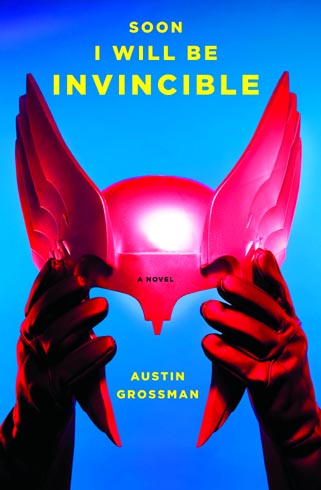
Soon I Will Be Invincible
by Austin Grossman
Pantheon Books: 2007
I have been trying to carve out time to read more "proper books" lately. As a teacher of rhetoric, what I mostly read are student papers, and I have been feeling a need for more finished prose. In between academic articles, I have been reading some popular fiction and literature, and in the middle of that lot was Austin Grossman's superhero novel.
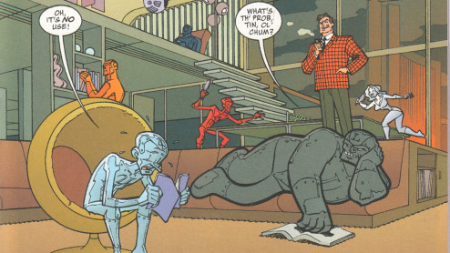
I'm not quite sure how I feel about this book. On the one hand, Grossman is a clearly capable writer: he balances plot and character development nicely, and the book moves along briskly. He has a deft hand with description, even detailing the costumes various heroes and villains wear without sounding silly, and he handles shifting points of view well - the book is narrated in alternate chapters by the villain Dr. Impossible and the hero Fatale - giving the book a strong voice in either case. He even narrates in the present tense without getting tiresome.
On the other hand, I'm not sure what this book is. Is it a serious literary novel using the conventions and tropes of superhero fiction? Well, sometimes it seems so, with Dr. Impossible musing at length on the ebb and flow of power and control and the nature of identity, but then it winks at the reader and gets a bit campy and too self-aware. Is it an attempt to write a realistic superhero story? Maybe, but the plot doesn't require all that much less suspension of disbelief than your typical Haneygram, however much naturalistic dialogue is grafted on. Is it just disguised fanfic, better-written and promoted? I don't think so, but sometimes it is tempting to think oh, that's Batman and Wonder Woman making out and if those are the Avengers, then those guys must be the Justice League and so on.
Overall, I got the impression that if the book were read by someone not already steeped in the superhero tradition, it would be too outre to make much of an impression, and if were read by someone familiar with the spandex set, it wouldn't contain enough new insights or treatments to be exceptional or even unusual.
I guess I enjoyed it, but I'm still not sure why.
Bonus review preview, How the heck did I miss this? Department:
I picked up a copy of Samurai: Heaven and Earth Volume 1 today.
A ronin versus the Three Musketeers? All four of them!?
How did this slip by me for over a year?
I've only given it a quick read so far, but I like what I've seen. More soon.
Subscribe to:
Posts (Atom)