Sunday, June 29, 2008

Another excursion into definition

Take a look at this little prose piece:

The proud Kuleeah was furious because Tarzan had made sport of her. Now she dashed toward him, determined to redeem her pride with his blood. She aimed a murderous blow at the head of unarmed ape-man. Again, Tarzan dodged, whirled, seized her, and lifted her high above his head. There he held her, kicking and squirming, while her comrades hurled gleeful taunts.

Though they laughed at Kuleeah's plight, they were impressed by the mighty Tarzan. “He can be my husband, though he conquer me and rule my hut,” cried one. This was heresy among the Amazons, who prided themselves on their dominance over men.


“I'll take him,” shouted another.

“No, he's mine,” insisted a third.

Soon, the tribe was in turmoil. As the warrior women fought amongst themselves, Tarzan set Kuleeah down. She ran away to get her bow and arrows. If she could not have him, no other would.

Then, suddenly, into this wild confusion burst a pack of hungry lions.

Although it does start in media res, this passage appears to be a pretty complete section of a narrative. Even from this excerpt, we can discern a lot about the characters and setting, and we can certainly follow the action. Is this a bit of a Burroughs book, or some fanfic, or what? Well, take a look at it in its original:

Click to embiggify

I ran across this Sunday strip at the ASIFA-Hollywood Animation Archive, which also has a wealth of comics and cartooning stuff.

I forget why I stumbled over it, but looking at this page immediately got me to thinking: there is no one, I think, who would exclude this page from a collection of comics, or comic strips, or sequential art, or graphic literature, or whatever phrase we want to use for all that funnybook stuff we like so much.

And yet, if we really look at the strip, there's no real fusion of word and image to make meaning or create communication. The text, as demonstrated above, can easily stand on its own and carry the entire narrative weight of the piece. The art, as exquisite as it is, really doesn't help to tell the story; it contains nothing new, no information that isn't already expressed by the text. The drawings certainly couldn't stand on their own and give us anywhere near the narrative detail that the text does. (For example, is there anything in panel four to indicate that the Amazons are "hurling gleeful taunts"?) To paraphrase Steve Lieber, the pictures may illustrate the story, but they aren't the story.

This seems to contradict what we expect from comics, that magical conjunction of words and pictures that creates something new, something that is neither merely prose nor art, but, well, comics.

We mist be missing something, but damned if I know what it is.

Maybe definition isn't that important after all.


This makes a dozen dozen posts on this blog: 144 entries in 915 days, about one a week. I know, that's pretty gross. I was looking for a significant milestone to quit on, and I thought this might be the one. But I don't think so now; there may be a few more things I want to say before that.
Sunday, June 15, 2008

Mail Call

Well, in an interesting development, this little internet web-log has received some comments on some old posts!

Someone liked the art from Lady Cop that I included in one of my earliest substantive posts, The Saga of Liza Warner, from January 4, 2006, and wanted to know the artists. This post came before I settled on the style of enlarging and bolding the titles and creator names of comics I review; I guess that was a good idea, because the information is included in the original post, but even I had a hard time finding it. (It's in small italics beneath the cover image.) For the record, the penciler was John Rosenberger and the inker was Vince Colletta.

Two people responded to my September 2, 2007 post ENO TAERG BPT! about the Silver Age JLA: Zatanna trade collection. That post included illustrations of the leggy magician by Murphy Anderson, Gil Kane, Carmine Infantino, and Mike Sekowsky; my correspondents are requesting, nay, demanding, a version by none other than -- Vince Colletta!

Well, I aim to please, so I did some research, but I have yet to find a Zatanna story penciled by Colletta, although he did ink a few, including the Romeo Tanghal preview in the same Zatanna trade. (Apparently, Colletta penciled a lot early in his career, but from the sixties on he almost exclusively focused on inking.)

I did find this great image of Zatanna pencilled by Don Heck and inked by Vince Colletta:


If you check the source post here on Gorilla Daze, you can read about Colletta's specific contribution to the illustration.

Saturday, June 07, 2008

I read a comic book

Giant-Size Incredible Hulk #1
Marvel: July, 2008
Roger Stern, Writer;
Zach Howard & Cory Hamscher, Artists


I was killing a little time in the LCS the other day when I saw this book on the rack; the cover was compelling. I hadn't read any Hulk books in at least a decade, but here he was, on the front of a comic, beautifully drawn (by cover artist Gary Frank), and in classic form. I had seen covers and illustrations of Hulk over the past few years in a t-shirt, a tuxedo, a gladiator outfit, and who knows what-all. To see him in the traditional ripped purple pants, thooming his way through what could easily be Monument Valley, brought back fond memories, and the book didn't seem to be part of any bigger saga (it even said "one-shot" on the cover). I flipped through it: the art didn't suck and there was a reprint in the back. I bought it, even at $3.99

It was totally cool.

I don't know if this is some kind of under-the-radar tie-in to the new movie or what, but the story is an episodic overview of Greenskin's career and would completely fill a new reader in on the character; for me, it was more of a refresher course and a current-continuity-check. I don't know how much they're left out, but it sure reads like 1978 wasn't thirty years ago.

Stern, who was a Hulk writer back in the day, gives us a framing sequence courtesy of Fred Sloan, an ex-hippie writer who was apparently a temporary part-time Hulk sidekick at some point when I wasn't reading the series. While researching his second book on the Hulk, Sloan encounters minor characters from Hulk's past adventures, each one providing a different perspective on both the myth and reality of the Green-skinned Goliath. Meanwhile, Bruce Banner is having his own current adventure, hulking out during a restaurant robbery and encountering plenty more action afterwards. Stern ties the two threads together very satisfactorily and gives us a final scene that captures the essence of what the Hulk TV series did best: portray the haunted journey of Bruce Banner. The narration from the three final panels is as touching and apt a description of that Jekyll-Hyde relationship as any I have ever read.

But as textured as the writing is, Stern doesn't leave out that all important Hulk Smash! action. In the present day, we get to see Hulk make quick work of armed robbers, scare a bear, smack a Winnebago, destroy a logging operation, punch a van, and leapfrog from the mountains to the California coast; in flashbacks, he smashes a statue, smashes a jeep, fights a bunch of soldiers, saves a school bus, and beats up some rednecks.

Through it all, Hulk displays the personality I remember best: not too bright, generally good-willed, but proud, easily annoyed, and quick to anger.

The art by Howard and Hamscher can be a little dicey at times, with some odd proportions and perspectives, but they have a great design sense: the flashback scenes are not only colored differently (kudos to Lovern Kindzierski) but also rendered differently, with thicker outlines and some Kirbyesque touches that evoke the Silver Age source material perfectly.

All that would have been enough to make me happy for my four bucks, but I also got to read a Stern & Byrne Champions-era Hulk story, guest-starring two members of that team, Iceman and Angel. However competent a story this is (and it is), it was really nothing but a nostalgia-wallow for me, getting to see Warren Worthington with his gold chain and suave moves, Bobby Drake feeling and acting awkward, Doc Samson with Hulk on the couch, Hulk pounding Samson into the ground like a tent peg, Jim Wilson calming Hulk down, and all the heroes taking on a Sentinel (after the ol' get-Hulk-involved-by-pissing-him-off ploy).

As much as the back-up was a trip down memory lane for me, I really do think I enjoyed the main story on its own merits and not just for its evocation of the "the way things were when I liked them," although I am willing to admit to a strong bias in that direction. Nonetheless, I can state categorically that this is one of the few mainstream comics that I have looked at lately that I wouldn't be embarrassed to be seen reading: there's no gratuitously graphic violence, no objectification or T&A, no hard-ass grittiness to prove how "adult" the material is. And most of the people in the stories are regular folks - this isn't a cape-fest. It was just good funnybook material.

Incredible, indeed.

Sunday, June 01, 2008

Comics blog comics

I was eagerly anticipating Fred van Lente's and Ryan Dunlavey's Comic Book Comics from Evil Twin. I thoroughly enjoyed Action Philosophers, and even used it in a composition class that I taught. I missed the new book when it first came out, and had to wait for my LCS to get their re-order before I could read it.

Man, was I disappointed.

I read Men of Tomorrow not too long ago, and just used Comic Book Nation in a class, and am in the middle of Hajdu's The Ten-cent Plague right now, so comics historiography is on my mind. Van Lente and Dunlavey do a pretty good job of chronicling the rise of comic books, but unlike AP, which seemed to clarify and popularize, this history seems too often to over-simplify and generalize. The authors have a strong analytical position - their treatment of animation as a necessary element to understanding comics is a fresh perspective, for example - but it seems that they were not terribly critical in assessing some of their sources. They seem to take the stories of Major Malcolm Wheeler-Nicholson's exploits prior to his publishing career at face value, for example, rather than including any additional information.

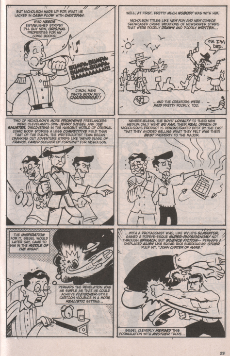
But scholarship quibbles aside, the major disappointment with book was just that it wasn't very good as comics. I couldn't see how presenting this in comics format added anything to to the telling: the creators don't really seem to be exploiting the form. On the contrary, most of the panels are merely non-sequential illustrations that "act out" the text without adding anything new to the communication. Take this page, which also includes the good major:


With the exception of the first panel, with its symbolic representation of Nicholson as a leader and where the word balloon dialog "Who's with me" is answered in the subsequent caption box, none of the illustrations adds anything to the text in any integral or creative way. Does the inclusion of a deliberately bad drawing in panel two really add to the description of the crude art found in early comics? Does a sketch of three swashbuckler types in panel three (two with Siegel and Shuster's faces) help us understand the description of strips like Henri Duval better? It would appear not.

There just seemed to be too much of this throughout the book. If I was just a little more OCD, I would type out all the caption boxes as straight text to see just how little editing it would take to turn the comic into prose. I'm betting very little.

So, as much as I enjoy reading about the history of comics, I'm not sure I'll be scooping up the floppies on this one. The trade may have to be part of my library just for the sake of completeness, but I'm afraid my enthusiasm for the project has dimmed.


And now, a little comicsy mystery:

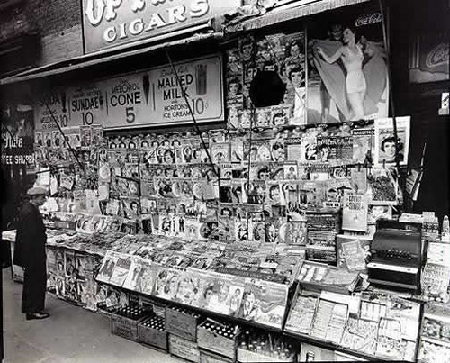
As I wander around the net, I often save images of people reading comic books and newsstands selling comic books, just for fun and personal use, like for computer wallpaper. Here's one that I found somewhere:


It seems to show a newsstand in early 1938, as you can see several copies of Action Comics #1 on the lower rack in the front right. Pretty cool piece of comics history, eh?

Well, it took a student of mine, who was looking on the net for a copy of this image after I showed it to the class as part of an exercise, to point me to this from the Museum of the City of New York:


Notice that the comics are gone, and with good reason: the photo was taken by Berenice Abbot in late 1935 - over two and a half years before Action was published.

Why would someone photoshop this picture?

Unfortunately, I haven't found a source for the doctored image yet. I'll let you know if and when I do, unless someone tells me first.

Until then, remember: document your sources!