Sunday, July 22, 2007
Not going to Comicon makes me sad
This is the year I turn fifty. It's not for a few weeks yet technically, but I already had a minor celebration with a bunch of high school buddies who are also passing the same milestone this year.
Another of the revels with which I wanted to mark the occasion was SDCC, Comic-Con International, or whatever it's officially called -- I wanted to go to San Diego. I have never been, although I attended some of Phil Seuling's early conventions and I've gone to several others cons. I thought that for a much as I have been involved in comics, I wouldn't want to pass a half-century without doing San Diego.
I had even started to make plans, when, wouldn't you know it, my sister decided that that weekend would be a perfect time to get married. Back on the east coast.
So, on Thursday, I won't be heading off to a weekend of geekish celebration in southern California, but rather a weekend of matrimonial obligation in central Connecticut. With great sister comes great responsibility, I guess.
So, I can't bring myself to talk about comics this week. I'm all choked up.
Tuesday, July 17, 2007
Sunday, July 15, 2007
What some people without blogs are thinking
This summer, I am teaching two sections of English 102, a standard college composition class for which I use graphic books as texts. We have read The Language of Comics as an introduction to scholarly analysis of the form; our texts includes Showcase: Superman, Watchmen, Why I Hate Saturn, and Maus, among others. I have introduced some of Scott McCloud's theory as a basis for formal analysis (since just about every article in TLoC cites him) and we watched and discussed a History channel documentary to get some sense of comics in a cultural perspective.
My morning section of about twenty students includes only one person who has read comics to any degree; to the rest, this might as well be a course in eighteenth century French romantic poetry, for as much as they know about the form. Nonetheless, they are digging in and working it.
The students will write two papers analyzing their choice from among the texts (in addition to other assignments). I thought it might be instructive to show you what they thought noteworthy, or at least interesting enough to write about, for the first paper. here are some tentative thesis statements from our first workshop:
I don't think I could have a comics blog without at least one graphic per post, so here's this:
When I was a kid, one of my favorite characters was Hank McCoy, the Beast. Not the furry blue cute-monster (I got the first appearance of the "new" Beast when it came out, and I didn't like it then) but the husky, barefoot X-man with the big vocabulary. (If only he had taken a Humanities major, he never would have gotten fuzzy...) Anyway, I had been hearing some good things about this X-Men: First Class series, so I broke down and picked up a floppy - Volume 2, #1 - hoping to see some old school action.
I was not disappointed: the series has enough youthful vigor, old-style sensibility, and humor to satisfy an old-timer like me. The X-men appear young, and interact like the less-experienced individuals they ought to have been at that point. Professor X is still professorial, but more human and real than Stan Lee or Roy Thomas ever made him. The Hank McCoy I knew and loved is there, with his specs and big words and formal style and warm byplay with Iceman. If this issue is any indication, I need to find the trade of Volume 1.
What was most surprising and worthy of note is that this is a comic book that I would unhesitatingly give to my daughter, if I had one. This particular issue focuses on Marvel Girl and some mentoring she receives from Sue Storm. Although Sue is still going by Invisible Girl, she is presented as a wise, capable professional with a lot to share. The interaction between Jean and Sue is understated, charming, and effective; it says more about nurturing our young women than any half-dozen PSAs combined, even with a couple of Nike commercials thrown in. Given the problematic treatment of women in superhero comics today, I applaud Jeff Parker for writing a story that had intelligence and sensitivity as well as chills, spills, and thrills (and include Roger Cruz for his unexploitative artwork).
My morning section of about twenty students includes only one person who has read comics to any degree; to the rest, this might as well be a course in eighteenth century French romantic poetry, for as much as they know about the form. Nonetheless, they are digging in and working it.
The students will write two papers analyzing their choice from among the texts (in addition to other assignments). I thought it might be instructive to show you what they thought noteworthy, or at least interesting enough to write about, for the first paper. here are some tentative thesis statements from our first workshop:
Though most of Watchmen tries to be liberal, there is still a theme of homophobia.Maybe about half of these statements are developed enough for a compelling paper, but they do include both formal and traditional literary analyses, as well as a few cultural inquiries; some of them would even get beyond the "no duh" response from jaded, long-time comics critics (well, maybe). I can't help but wonder what approaches I would get if I gave the same assignment to a bunch of fanlings.
Color
Rorschach and Eddie are both main characters in Watchmen who happen to see their terrible world for what it is. Eddie embraces it and finds pleasure in the sickness, while Rorschach is depressed and lives in misery because of it. Although their outlook is the same, their reaction is different, and therefore compelling.
Dr. Manhattan’s destruction and then regeneration into a presumed perfect, god-like being can be paralleled in the book by a society needing to regenerate itself as well.
Although Superman comics are juvenile, simplistic, and made for kids, adults can also enjoy them. They teach a lesson that everyone can relate to.
That Superman/Clark Kent is not the perfect role model that he is made out to be.
Through the characters and images, Watchmen by Alan Moore and Dave Gibbons discusses some issues people face and can relate to.
Even though Dr. Manhattan wants to be with Laurie, Laurie wants to smash and break up with him.
While Superman is often thought of as a paradigm of the perfect being, deep inside this shell Superman reflects society’s fears, creating a parallel world where all these fears are overcome by a paradigm of the perfect being.
These stories in Showcase: Superman show that technology can help create a utopian-like society, but abuse of the planet to assist advancement could lead to our destruction.
Superman is a self-absorbed hero who puts himself first and the universe second.
Although conventionally seen as a psychopath, Rorschach is the actualization of personal reality contained within every human being.
Robert C. Harvey defined comic books as a blend between pictures and word. According to this definition, the pictures and words are vital to each other. Why I Hate Saturn by Kyle Baker is a comic book where pictures and words work against each other and this results in confusion for the reader.
As Superman’s friend, Jimmy Olsen helps Superman with some of the problems that occur, and as a character of the comic, the young readers can relate to Jimmy because of the role he plays.
Alan Moore closes each chapter of Watchmen with a famous literary quote. By using quotes as a template for his writing, Moore transforms the words of others into an underlying theme that helps develop the plot and progression of his characters.
The Superman comics use a narrative caption in nearly every panel; this word-image relationship allows the story to take place quickly and appeals to the younger audience.
Art Speigelman wants readers to be shocked by the strategically placed real photographs [in Maus]; he wants the reader to be forced into seeing the reality of the holocaust if only for a few moments in each book. Seeing these photos is more disturbing than the disjunction between animal characters and the horrifying plot.
Superman is a good role model for the children in teaching moral values.
I don't think I could have a comics blog without at least one graphic per post, so here's this:
When I was a kid, one of my favorite characters was Hank McCoy, the Beast. Not the furry blue cute-monster (I got the first appearance of the "new" Beast when it came out, and I didn't like it then) but the husky, barefoot X-man with the big vocabulary. (If only he had taken a Humanities major, he never would have gotten fuzzy...) Anyway, I had been hearing some good things about this X-Men: First Class series, so I broke down and picked up a floppy - Volume 2, #1 - hoping to see some old school action.
I was not disappointed: the series has enough youthful vigor, old-style sensibility, and humor to satisfy an old-timer like me. The X-men appear young, and interact like the less-experienced individuals they ought to have been at that point. Professor X is still professorial, but more human and real than Stan Lee or Roy Thomas ever made him. The Hank McCoy I knew and loved is there, with his specs and big words and formal style and warm byplay with Iceman. If this issue is any indication, I need to find the trade of Volume 1.
What was most surprising and worthy of note is that this is a comic book that I would unhesitatingly give to my daughter, if I had one. This particular issue focuses on Marvel Girl and some mentoring she receives from Sue Storm. Although Sue is still going by Invisible Girl, she is presented as a wise, capable professional with a lot to share. The interaction between Jean and Sue is understated, charming, and effective; it says more about nurturing our young women than any half-dozen PSAs combined, even with a couple of Nike commercials thrown in. Given the problematic treatment of women in superhero comics today, I applaud Jeff Parker for writing a story that had intelligence and sensitivity as well as chills, spills, and thrills (and include Roger Cruz for his unexploitative artwork).
Sunday, July 08, 2007
Now I know Jack
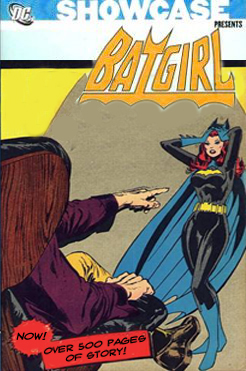
Before I begin to go on about Jack Staff, I want to recount this anecdote: I was in my LCS and my partner, a female-type person, met me there before we went off on a mutual errand. As she scanned the titles on the shelves, she saw this issue of Green Lantern. Her response to it was to point and say "Ah, boobies!" We talked about it later and it turned out that while she wasn't particularly offended (although she did find the female figure somewhat objectified), she presumed that the breasts were supposed to be the focal point of the picture. Let me say that again: an intelligent woman (a poet and artist), more or less unfamiliar with the conventions and tropes of superhero comics, thought that a cover containing a (to my eye) fairly typical representation of a female character indicated that the story was somehow about sexual themes, not heroism or adventure or villainy or conflict. I would say that this was food for thought, but really it's just another example of an issue that has been well-proven but which is still not accepted as a "real" issue by significant portions of comics readership (and creatorship). Le sigh.
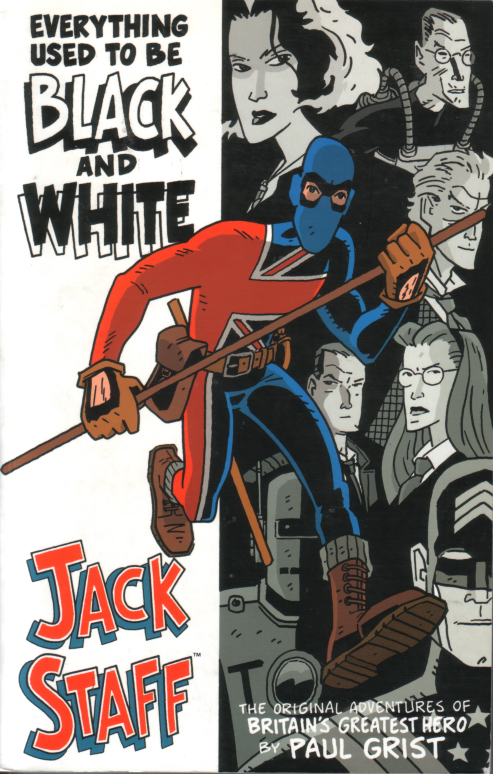
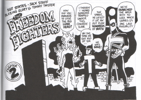
Well, since I don't read mainstream superhero comics much anymore (because of that very kind of stuff), what I left the shop with was Jack Staff Volume 1: Everything Used to Be Black and White by Paul Grist
This was more like it. The volume collects the first twelve issues of Grist's British take on the superhero genre, which he maintains is mostly unexplored in British comics. I found this approach to be refreshingly rich; although Jack Staff is clearly a superhero figure, he inhabits a world that is both quirkier and more familiar than most comics worlds, making him not so much a unique figure as someone is just one more standard deviation off the mean than most people.
From the get-go, the book is a clear bargain that confirms my choice to "wait for the trades." For a double sawbuck, I got almost 350 pages of story; if I had spent the same money for five floppies, I would only have a had a third of that. Granted, this collection is in black and white, but since that's how the stories were originally presented, there's no content lost, and Grist is a master of the black and white idiom anyway.
In addition to the sheer number of pages, Grist just packs the book, first with characters. In addition to Jack, we have Becky Burdock, Girl Reporter (who becomes Vampire Reporter in short order); an hommage to The Invaders; a robot man; an old-fashioned copper (who could have been the inspiration for Jerry Lynch in Intermission); agents of a special branch, supernatural-type; agents of a special branch, superspy-type; in-story parodies of Neil Gaiman and Alan Moore; a Victorian escapologist; a retired super-thief; and many more.
The characters propel a narrative that is complex and layered, and Grist relates it in an overlapping, non-linear style that requires full engagement on the part of the reader but which never quite crosses the line into confusion or obscurity. There are no real sub-plots; there are multiple plots playing themselves out simultaneously. One sequence in particular, involving the intersection of the main protagonists at bank robbery, pulls off the shifting between multiple points of view exceptionally well.
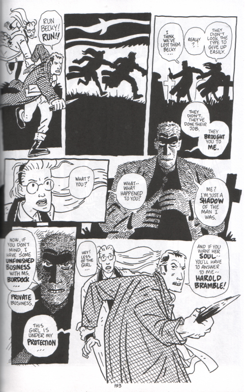
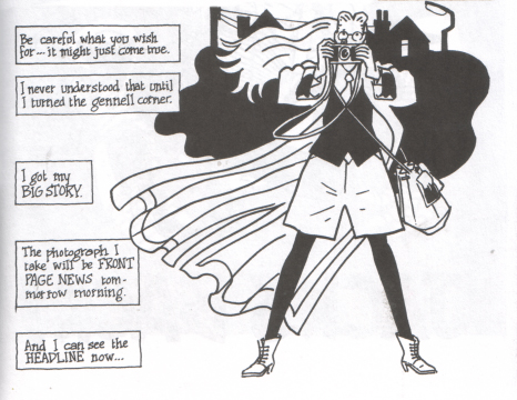
Grist's layouts are as dynamic as his narrative structure; he uses lots of panels per page and some innovative sequences. Sometimes they work and sometimes they don't, but they are always interesting. Check out this sequence in which Burdock finds herself an unlikely ally; see how it stacks up using Skipper Pickle's methodology for examining page composition.
There was so much to like in this collection. Many of the characters are take-offs from established television or comics characters. I knew some of them and got a sense of some others, but the references never detract from the story and anyone could have a great time without "getting" any of them. Grist re-imagines the familiar through his working-class British lens and makes everything fresh for all readers.
Another thing that every reader will come away with is the sense that Grist can write strong female characters. There is no T&A in the book, no damsel in distress, no woman-in-peril, no "the girl." The lead agent for Q, the supernatural cops, is the tough-as-nails Helen Morgan, a sort of Stephen Strange in a green trench coat. Becky Burdock is another great example: her "rescue" by the affable vampire-hunter in the sequence above presents him as the romantic naif that he is; Becky may appreciate assistance but doesn't need rescuing. She is tougher and smarter than Lois Lane, even if she is stuck at a tabloid.
I would compare this shot with what passes for images of "realistic" women in mainstream comics, but I don't have it in me to heave another sigh.
Not too long ago, I expressed frustration at trying to find "robust, intricate stories, set firmly in the [superhero] genre, that engage my imagination, intellect, and emotions." I was looking for stories in which "maturity" meant emotional complexity, not gratuitous sex; in which the action didn't necessarily have to involve dismemberment and torture to be "serious"; and in which the characters act in ways that human beings that inhabit the actual world would, no matter how fantastical their circumstances. Jack Staff gives me all that, and I can't wait for the next installment.
Sunday, July 01, 2007
Your primary medium is the knowledge and expectations of your audience
This weekend (Friday and Saturday) I had the pleasure of taking a class at the Pacific Northwest College of Art in Portland: CED 312-1, Graphic Novel: Narrative and Persuasion, taught by Scott McCloud.
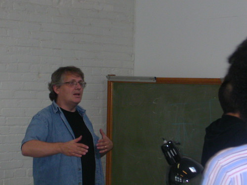
Essentially, this a sixteen-hour lecture and lab version of the content from Making Comics, McCloud's latest book, a primer on how narrative works in comics(1). Although I have read and re-read the book (along with Understanding Comics), and use a lot of McCloud's principles and models when discussing comics in the classroom, I found the experience of working directly with McCloud very valuable. While I can't say there were revelations and new insights to be gained from the class for someone familiar with McCloud's written works, the practical application of techniques and the peer and instructor critique added a depth to my understanding.
The student made up a mixed bag. Some were matriculated students at PNCA taking the class for credit; for some people this was the end of a week-long course in graphic novels that had included other classes (one taught by Trina Robbins); some, like me, were just taking Scott's segment. Some were already comics creators or wanted to be, but that was certainly not universal: one fellow was looking at all forms of narrative to find an idiom in which to present his memoirs and another guy was a mediator looking for new models of creative thinking. The class of thirty or so was split about evenly between men and women; the youngest student was a 17-year-old girl and there were at least two men in their sixties, with the rest of us spreading out between the extremes.
Scott started the class with a slide show that outlined the typical steps in the creation of a comics narrative - plot outline to script to layout to pencils to inks - and then explained how any or all of them could be omitted or truncated.
This led into an exercise that replicated the guy-finds-a-key story in Making Comics (page 11): Scott gave us a short story summary(2) and we had ten minutes to create a strip that told the story as we understood it. Students took from three to fourteen panels to compose the narrative; I took five (or six, depending on how you count) - how many would you use?
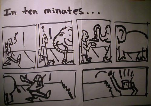
As we critiqued each and every strip in panel number order, we could see clearly how the tension between economy and detail worked itself out in each person's creative act and the choices they made(3).
"Choices" is, of course, Scott's overarching conceit for the creative process: he breaks down comics creation into Choice of Moment, Choice of Frame, Choice of Image, Choice of Word, and Choice of Flow. The panel count, for example, is one aspect of a creator's Choice of Moment: how many are necessary to tell the story you want to tell?
The class was not designed to go into much detail regarding Choice of Flow, which is concerned with page-level layouts and alternate web layouts(4), but we continued with more lecture on Choice of Moment (including a review of the six types of panel transition(5)) and moved into talking about Choice of Frame and the balance between clarity and intensity. We looked at stories by Moebius, Drooker and Huizenga to illustrate the concepts being discussed, and it tuned out that reading comics on a big screen worked surprisingly well.
We then moved into the studio for some extended exercises, the first of which was rendering (in twenty minutes) a six-panel script that deliberately included disjunctive elements. This narrative quirk compelled a high degree of clarity on the part of the creator, since logical extrapolation would not help get a viewer to the message. This strip by a classmate(6) is a good illustration:
The representation of the supermarket activities in the first three panels is spot on and entirely clear; the introduction of "a rhino falls from the ceiling" in panel four works less successfully, since the rhino looks a bit like a pig with a mask on, and without any contextual clues, the closure that gives a reader "rhino" was not certain. In this case, it did not seem to be a question of Choice of Moment (that was specified in the script) or Choice of Frame (it seems fitting), but just Choice of Image (and more practically, no chance for a reference image).
In the interest of full disclosure, here's my strip for the same assignment. I had a slightly more complicated script and executed it with much less skill:
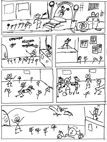
We all completed different strips like these and reviewed them in small groups; each group selected one strip for a larger discussion. The relative clarity (or lack of it) as a result of creator choices was apparent.
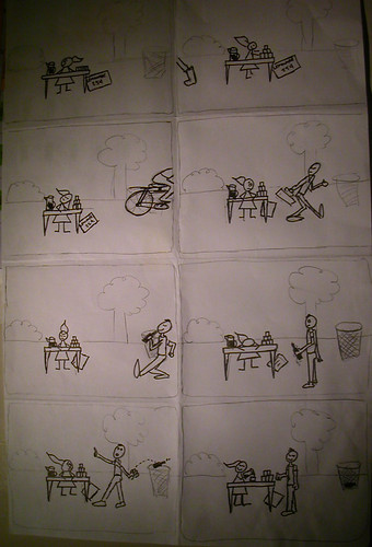
We followed this activity up with an even longer strip: the instructions were to use a straightforward four-by-four, sixteen panel grid to create a narrative based on your own life. This became a two-level exercise for me. On the one hand, it was a more in-depth look at the same kind of choices as we were making in the short strip: since the details of our lives were personal and peculiar, clarity of presentation was extremely important so the specific details of the narrative could be understood.
The second level, however, resonated with me more as a teacher of writing: many people began by depicting their birth and ended with coming to the class we were in, and were dissatisfied with their attempt to accurately depict their entire lives in just sixteen panels. Very few students chose to move to the specific rather than the general and to tell the story of just one aspect of their lives. This approach, which I took (showing only education and employment) might give a narrative which is less comprehensive but more solid, with a clearer narrative arc. Here's the strip:
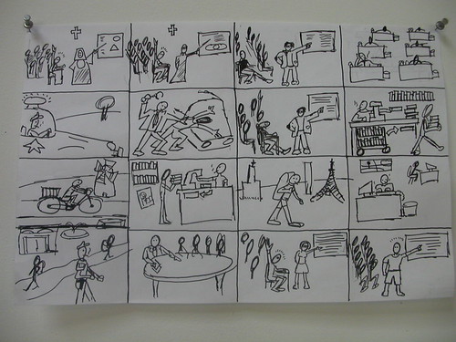
In any case, the exercise stretched people's creativity (we had only an hour and twenty minutes for the whole thing), and the critique - Scott went over every piece in detail - took the end of Friday and the first hour of Saturday, and covered Moment, Frame, and Image.
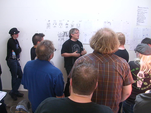
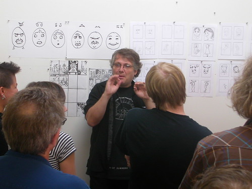
Saturday morning continued with a lecture on character design as an example of Choice of Image (with what seemed to be a slight digression into the "shape of storytelling"(7)). Then the presentation turned into more of an art class, with Scott demonstrating the look of the six emotional primaries - anger, fear, disgust, joy, sadness, and surprise - and showing how the secondary, more complex emotions were combinations of the physical elements that make up these primaries. Much of Saturday was filled with studio exercises in communicating different emotions through facial expression and body language. My attempts at illustrating these gradations were not successful enough to add anything to this account, but you can see some other versions on the wall in this photo.
Our final project was to create a fully developed narrative strip (in ninety minutes) that demonstrated our understanding of the Choices. For better or worse, this is as good(8) as my understanding got:
Overall, I have to say that I was impressed with Scott McCloud as a classroom instructor. He is clear, personable, and accessible, and presents the material in a manner that models collaboration with the student rather than preaching. For me, the class was more review than enlightenment, but it was a rich and textured review that increased my confidence with the material. Unfortunately, due to technical glitches, Scott was unable to present his lecture on Choice of Word, the segment that might have been of the most interest to me, but I still got a lot out of the entire experience, and took away some ideas for my classes.
If you ever have a chance to take one of these classes, do it.
(1) Notwithstanding Neil Cohn's recent post on nomenclature, I continue to use comics as the shorthand for sequential art, however we may wind up ultimately defining it.
(2) For the record, the summary was A man walks down a sidewalk, whistling. He meets an elephant, who gives him a cell phone. He thanks the elephant and continues walking, talking on the cell phone. He then falls off a cliff.
(3) This tension reminds me of an approach to judging the best length of a written piece: use as few words as you can and as many as you need to. (This is itself a paraphrase of advice I heard from a driver's ed instructor: drive as fast as you can and as slow as you have to.)
(4) Although that didn't stop me from responding to the latest post on the wonderful Remedial Comics.
(5) Moment-to-moment, action-to-action, subject-to-subject, scene-to-scene, aspect-to-aspect, and non sequitor.
(6) For the record, I don't think anyone in the class was more fluent in the language of comics than this creator.
(7) McCloud held that you can't have a story unless someone wants something, and that the three templates are "desire achieved and then rejected" (Wizard of Oz), "desire denied and then rejected" (It's a Wonderful Life), and "desire achieved" (The Little Mermaid). I had not encountered this model before.
(8) Scott took this strip apart kindly but quite thoroughly and pointed out lots of places for improvement. He also didn't like that the "achievement of desire" came about more through the kindness of a stranger than the girl's own effort, which seems a valid criticism.
Note: The post title comes from McCloud's mantra all weekend.
Subscribe to:
Posts (Atom)