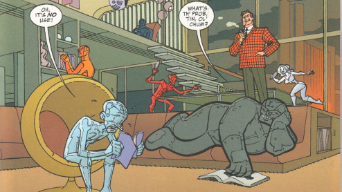
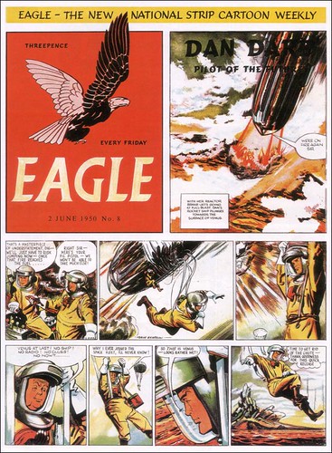
I was listening to NPR this morning and they had a short feature on Toby Barlow's new book, Sharp Teeth, a contemporary werewolf story written in free verse. I was only half-listening, and heard some references to Homer and whatnot, but then caught Barlow describing his book as a "graphic novel without pictures."
Hunh?
The NPR website lists the full quotation: "a ripping yarn with the extra words ripped away ... a graphic novel without the pictures, or a hard boiled novel that's been boiled down to a reduction sauce."
As Jude Law said in I Heart Huckabee's: wait, what does that even mean?
Isn't the essence of comics (and hence, graphic novels) something about the words and pictures working together to carry the narrative? Or just pictures, when there are no words? The excerpt I read looked more like an epic poem than anything anything else. Isn't poetry already distilled language, concentrated imagery, that conveys more with less? Does this metaphor really add any depth to the description that calling it poetry doesn't?
I don't think so. And I think there might be another reason behind its use. Googling the phrase only garners two hits: in a review of Richard Morgan's first novel, the science fiction story Altered Carbon and in a review of comics writer Warren Ellis's first prose book, the gonzo detective novel Crooked Little Vein. In addition, Barlow's book itself sports this blurb from Scott Smith: "If Ovid had been raised on a steady diet of Marvel Comics, Roger Corman, and MTV, he might have written something like Toby Barlow's Sharp Teeth." All this seems to indicate to me that something else is going on.
I think this metaphor is the highbrow marker for confusing form with genre when thinking or talking about comics. I don't think any of the three uses of this metaphor - even by the author himself - really indicates anything about the narrative structure or energy of the text; I think they're shorthand (or code) for saying something about the book's content and its relative value or merit, the same way an action film might be accused of having a "comic book plot."
I'm not sure how I feel about that, but I think it is what's happening.
Update - full disclosure:
Re-reading this post today, I realized I had only searched for "graphic novel without pictures." However, a search for "graphic novel without the pictures" (that ignores Sharp Teeth references) only nets a few more results:
In a parent's guide to children's books discussing Quantum Prophecy, described in brief as "Comic-book style superhero action; moral dilemmas, some driven by visions of the future."
In a review of An Alchemist with One Eye on Fire, a collection of poetry described as having "cartoon-like imagery."
In a customer review on Amazon of The Doomsday Brunette, a book about "genetically engineered superwomen."
In a customer review on B&N of The Traveler, in which the book's action sequences are compared to Kill Bill and V for Vendetta.
In a personal remembrance of having read Nine Princes in Amber by Roger Zelazny over thirty years before.
All of these seem to support my initial response.
There was one different take. In a blog review of The Plot to Save Socrates, the reviewer notes the author's spare writing and lack of descriptions, and uses the graphic novel metaphor as negative criticism.
So, is this a mostly useless little phrase, then?
Sunday, March 23, 2008
Wednesday, March 19, 2008
Sad sack
So, I was sitting around in a local corporate coffeeshop, thinking about my missed post from last weekend and wondering if I wanted to have a strack, squared-away blog like The Fortress of Fortitude, with regular features and timely posts (and excellent writing), or a casual, whenever-the-spirit-moves-me blog, like Estoreal (with its excellent writing).
The spirit hasn't moved me much this week, that's for sure: Arthur C. Clarke died; he was a particular hero of mine, and his passing genuinely saddened me.
There were other, minor, more transitory sadnesses. I missed Comic Book Comics #1 when it came out, and my LCS still hasn't received their re-order.
I signed up to take a comics scripting class taught by Shary Flenniken at the Richard Hugo House, but there's only two of us registered (I think the other person is David Lasky) so it may not go.
And I went on the internets today to read my regular blogfeeds and found two bloggers, both of whom I enjoy reading, engaged in yet another comicsweblogosphere pissing match, the likes of which I think we have too much of already.
So, even though I am posting late, and even though I have not even made up my mind what this blog will be, all it is today is this:
Sunday, March 09, 2008
80pg. Giant
Twelve-step review:
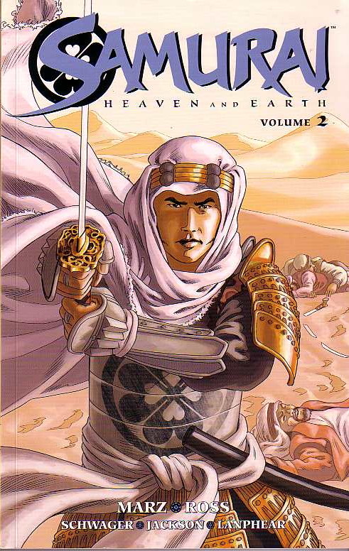
Samurai: Heaven and Earth - Volume 2
by Ron Marz, Luke Ross, Rob Schwager, Dan Jackson, and Dave Lanphear
Dark Horse: 2007
1. Our story continues the adventures of Shiro, a misplaced samurai fighting his way across early eighteenth century Europe in search of his lost love, Yoshi. In this arc, Shiro makes his way though Spain, across the Mediterranean, and then across North Africa from Tripoli to Egypt.
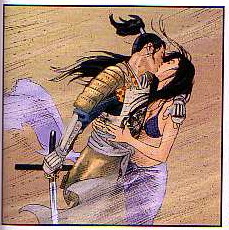
2. Shiro picks up an ally of sorts on his journey: the Arab slaver who initially brought Yoshi from her captivity in China to Europe. They even get a "meet cute" moment:
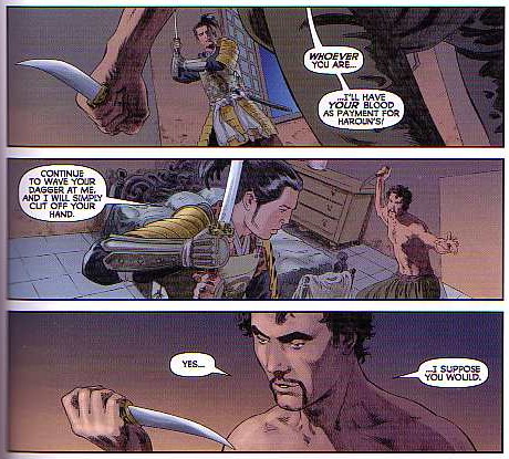
3. Shiro's partnership with Al-Din and his need of the trader's local knowledge and contacts serve to somewhat mitigate the sometimes omnipotent nature of the character. There seems to be no army that Shiro cannot defeat singlehandedly; I wanted to see him succeed more by guile or determination or experience and less by just being better than everyone else.
4. Marz's script now include flashbacks to Japan at the start of every chapter. I think that this device works even more effectively in the collection as it would have in individual issues; the two "stories" merge nicely at the end of the book. Notwithstanding Shiro's unstoppability, Marz paces the quest and cliffhangers that appear throughout the plot well.
5. Don Miguel, the duplicitous Spanish ambassador from the first book, is developed further as a villain of major standing, and Yoshi is given more time of her own to shine.
6. The language issue that I mentioned in my review of the first book is given minor attention, but is still never really addressed. That's still okay.
7. The issue of Yoshi's sexual experiences while in captivity, on the other hand, is addressed directly, forthrightly, and in a sophisticated adult manner. Kudos.
8. Luke Ross's art is still totally gorgeous. The shift in setting to North Africa allows him to indulge himself in a whole different collection of set pieces and determining shots. Somebody referred to this part of the series as Shiro of Arabia, and it has the same epic sweep as the David Lean film. The people are still beautiful to look at as well.
9. In addition to the flashbacks mentioned above there is another device that I think works better - or only - in the collection. Page six of chapter one (a full-page spread) is perfectively and effectively echoed on page eight of chapter five. I'm not sure this would have been as compelling if I had seen the images four months apart rather than less than an hour. (It is precisely this kind of effect that the form of the physical text has on narrative that I might use as my research focus for my doctorate.)
10. The book contains another great slew of bonus features: design sketches, unused cover concepts and a gallery of the characters by different artists.
11. The most interesting feature in the extras will be incorporated into my class on comics nd sequential art next quarter: Ross penciled one fight scene as a two-page spread, and then had to re-arrange the panels when he realized the scene would actually fall on the recto and verso of the same page. It is a great example of the interplay of narrative, art, panel design, and page layout in comics.
12. I don't think it's too much of a spoiler to let you know that the lovers are re-united - at least for a time: there are clearly more struggles ahead and another five-issue arc is promised. I'll sure be waiting for the trade.
Not a review
I picked up a copy of Fantastic Four: The Lost Adventure #1. This book, billed as a Stan Lee/Jack Kirby production, takes an unpublished story by Stan and Jack and presents it three ways: as reproductions of the original pencils, complete with marginal notes; within a different published story that used some of the panels and pages - out of context - as a flashback sequence; and as the complete story as it was originally intended to be seen back in 1970, with post facto production assistance from contemporary professionals. I find this a wonderful piece of work, if only for its glimpse into the creative and productive processes that go into a comic book. This will be another text for the class to consider.
Five-star review:
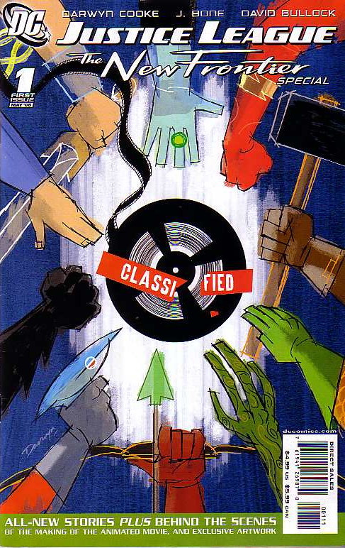
Justice League: The new Frontier Special #1
by Darwyn Cooke, J. Bone, and David Bullock
1. This is not so much a review as a love letter. Darwyn Cooke just gets superheroes better than anyone else at DC and has a design sensibility and visual elan than I just can't get enough of.
2. Cooke's fight between Superman and Batman in the main story makes you realize just how silly and self-indulgent Frank Miller can be, and was even back in The Dark Knight Returns. Cooke, on the other hand, provides a slam-bang action story without sacrificing any character consistency. Cool beans, indeed.
3. I grow more and more in love with Cooke's Wonder Woman. Man-o-man, wotta woman!

4. The Robin and Kid Flash team-up tale was everything that I had hoped The Teen Titans Lost Annual was going to be, and wasn't. Haney's magic didn't survive him, and that post-mortem concoction just fell flat. This story, however, is an hommage, not a reproduction, and it positively zings; can you dig it, daddy-o?
5. The rest of the issue was full of more fun: a pitch-perfect Rip Hunter intro; a frothy, funny Wonder Woman-Black Canary-Gloria Steinem (!) team-up; some behind the scenes art from the New Frontier DVD; and the hidden jewel of the piece: a National Comics in-house ad from an Elseworld where John Henry and Martian Manhunter had their own ten-cent comics alongside Green Lantern.
Compare and contrast
I went to see the Persepolis movie today.
Y'know, I have to say that I was never a big fan of the book. It was the Seattle Public Library's "Everybody Reads" pick a few years back, and I even gave a talk on "How to Read a Graphic Novel" in conjunction with that event that used the memoir as its centerpiece, but I never really thought it was that good. Marjane Satrapi clearly has a compelling story to tell; I just don't think that she is that accomplished as a storyteller. The book doesn't really exploit the potential of the form, the art doesn't captivate me, and the story seems to just chug along without much momentum. Maybe I'm missing something, but I never quite got what all the fuss was about.
The film, on the other hand, has some magical moments, is beautifully visualized, and has condensed the story into a tighter narrative arc that moves briskly. It was not a great film, but surely a good one. When I came home, I took another look at the books, and realized that the parts that seemed to work the best for me on the screen were those parts that deviated the most from Satrapi's original vision on the page. I don't know if she just had wonderful collaborators or if film is her true medium, but the movie is so much better than the comic that it is hard to figure out. I'll have to give this a lot more thought (and maybe ask my students!).
Meta
It seems this little corner of the blogoverse must have passed some sort of threshold, because I am starting to get some solicitations for reviews, which has never happened before. This really isn't primarily a "new stuff" blog, so I don't think I'll be going that way, but I wanted to share a piece of the latest request I got, verbatim:
I was wondering if you would be interested in reading it and perhaps giving it a review on your "internet web-log."
So, is that the subtlest irony ever or genuine?

Samurai: Heaven and Earth - Volume 2
by Ron Marz, Luke Ross, Rob Schwager, Dan Jackson, and Dave Lanphear
Dark Horse: 2007
1. Our story continues the adventures of Shiro, a misplaced samurai fighting his way across early eighteenth century Europe in search of his lost love, Yoshi. In this arc, Shiro makes his way though Spain, across the Mediterranean, and then across North Africa from Tripoli to Egypt.
2. Shiro picks up an ally of sorts on his journey: the Arab slaver who initially brought Yoshi from her captivity in China to Europe. They even get a "meet cute" moment:

3. Shiro's partnership with Al-Din and his need of the trader's local knowledge and contacts serve to somewhat mitigate the sometimes omnipotent nature of the character. There seems to be no army that Shiro cannot defeat singlehandedly; I wanted to see him succeed more by guile or determination or experience and less by just being better than everyone else.
4. Marz's script now include flashbacks to Japan at the start of every chapter. I think that this device works even more effectively in the collection as it would have in individual issues; the two "stories" merge nicely at the end of the book. Notwithstanding Shiro's unstoppability, Marz paces the quest and cliffhangers that appear throughout the plot well.
5. Don Miguel, the duplicitous Spanish ambassador from the first book, is developed further as a villain of major standing, and Yoshi is given more time of her own to shine.
6. The language issue that I mentioned in my review of the first book is given minor attention, but is still never really addressed. That's still okay.
7. The issue of Yoshi's sexual experiences while in captivity, on the other hand, is addressed directly, forthrightly, and in a sophisticated adult manner. Kudos.
8. Luke Ross's art is still totally gorgeous. The shift in setting to North Africa allows him to indulge himself in a whole different collection of set pieces and determining shots. Somebody referred to this part of the series as Shiro of Arabia, and it has the same epic sweep as the David Lean film. The people are still beautiful to look at as well.
9. In addition to the flashbacks mentioned above there is another device that I think works better - or only - in the collection. Page six of chapter one (a full-page spread) is perfectively and effectively echoed on page eight of chapter five. I'm not sure this would have been as compelling if I had seen the images four months apart rather than less than an hour. (It is precisely this kind of effect that the form of the physical text has on narrative that I might use as my research focus for my doctorate.)
10. The book contains another great slew of bonus features: design sketches, unused cover concepts and a gallery of the characters by different artists.
11. The most interesting feature in the extras will be incorporated into my class on comics nd sequential art next quarter: Ross penciled one fight scene as a two-page spread, and then had to re-arrange the panels when he realized the scene would actually fall on the recto and verso of the same page. It is a great example of the interplay of narrative, art, panel design, and page layout in comics.
12. I don't think it's too much of a spoiler to let you know that the lovers are re-united - at least for a time: there are clearly more struggles ahead and another five-issue arc is promised. I'll sure be waiting for the trade.

Not a review
I picked up a copy of Fantastic Four: The Lost Adventure #1. This book, billed as a Stan Lee/Jack Kirby production, takes an unpublished story by Stan and Jack and presents it three ways: as reproductions of the original pencils, complete with marginal notes; within a different published story that used some of the panels and pages - out of context - as a flashback sequence; and as the complete story as it was originally intended to be seen back in 1970, with post facto production assistance from contemporary professionals. I find this a wonderful piece of work, if only for its glimpse into the creative and productive processes that go into a comic book. This will be another text for the class to consider.
Five-star review:

Justice League: The new Frontier Special #1
by Darwyn Cooke, J. Bone, and David Bullock
1. This is not so much a review as a love letter. Darwyn Cooke just gets superheroes better than anyone else at DC and has a design sensibility and visual elan than I just can't get enough of.
2. Cooke's fight between Superman and Batman in the main story makes you realize just how silly and self-indulgent Frank Miller can be, and was even back in The Dark Knight Returns. Cooke, on the other hand, provides a slam-bang action story without sacrificing any character consistency. Cool beans, indeed.
3. I grow more and more in love with Cooke's Wonder Woman. Man-o-man, wotta woman!

4. The Robin and Kid Flash team-up tale was everything that I had hoped The Teen Titans Lost Annual was going to be, and wasn't. Haney's magic didn't survive him, and that post-mortem concoction just fell flat. This story, however, is an hommage, not a reproduction, and it positively zings; can you dig it, daddy-o?
5. The rest of the issue was full of more fun: a pitch-perfect Rip Hunter intro; a frothy, funny Wonder Woman-Black Canary-Gloria Steinem (!) team-up; some behind the scenes art from the New Frontier DVD; and the hidden jewel of the piece: a National Comics in-house ad from an Elseworld where John Henry and Martian Manhunter had their own ten-cent comics alongside Green Lantern.
Compare and contrast
I went to see the Persepolis movie today.
Y'know, I have to say that I was never a big fan of the book. It was the Seattle Public Library's "Everybody Reads" pick a few years back, and I even gave a talk on "How to Read a Graphic Novel" in conjunction with that event that used the memoir as its centerpiece, but I never really thought it was that good. Marjane Satrapi clearly has a compelling story to tell; I just don't think that she is that accomplished as a storyteller. The book doesn't really exploit the potential of the form, the art doesn't captivate me, and the story seems to just chug along without much momentum. Maybe I'm missing something, but I never quite got what all the fuss was about.
The film, on the other hand, has some magical moments, is beautifully visualized, and has condensed the story into a tighter narrative arc that moves briskly. It was not a great film, but surely a good one. When I came home, I took another look at the books, and realized that the parts that seemed to work the best for me on the screen were those parts that deviated the most from Satrapi's original vision on the page. I don't know if she just had wonderful collaborators or if film is her true medium, but the movie is so much better than the comic that it is hard to figure out. I'll have to give this a lot more thought (and maybe ask my students!).
Meta
It seems this little corner of the blogoverse must have passed some sort of threshold, because I am starting to get some solicitations for reviews, which has never happened before. This really isn't primarily a "new stuff" blog, so I don't think I'll be going that way, but I wanted to share a piece of the latest request I got, verbatim:
I was wondering if you would be interested in reading it and perhaps giving it a review on your "internet web-log."
So, is that the subtlest irony ever or genuine?
Labels:
graphic books,
new comics,
not comics,
self-referential
Saturday, March 01, 2008
Twelve-step review (with bonus video): Justice League: The New Frontier
 So, true to their word, the fine folks at M80 sent me a preview copy of the new Justice League: The New Frontier DVD to review. (It didn't look anything like the image to the left; the package was different and there was only one disk. I think I might have the Brazilian version, since the alternate language is Portuguese. )
I decided to try something a little different and invite five friends over to watch the movie and offer their comments. We have a wide range of perspectives represented, from an old-school comics fan who has read the New Frontier comics to someone who is not a comics fan and hasn't ever laid eyes on the original story; their relative exposure to the genre and the story are reflected in their "scores" on the video. Check it out and see for yourself. (Oh, yeah, and I guess there's a spoiler alert for this whole thing._
As for my take on it:
1. For the record, I loved the original. It spoke to my personal experiences and coming-of-age and had a design sensibility that I enjoyed, as well as presenting what I thought was pretty good story even without all the insider stuff.
2. The video does a pretty good job of telescoping the plot down to a manageable level; some history and some characters are sacrificed, but it would have been unwieldy otherwise.
3. The condensation of the plot reduces minor roles to cameo appearances: Mlle. Marie makes a few brief appearances and has one line; the Challengers of the Unknown are never named and appear solely as purple jumpsuits walking on a dead pterodactyl; the Blackhawks glower and shout "Hawk-aaa," but that's about it; and Green Arrow doesn't even get any lines.
4. The upshot of this characterization shorthand is that the viewer only gets it if they already got it; some of the best throwaway bits are wasted on the non-fan. It seems this would limit the movie's potential audience.
5. The movie also reveals that superhero dialog that works great on the page is often not as impressive when acted out. Batman's "penny for a book of matches" line and Farady's "real men wear pants" are two good examples.
6. Darwyn Cooke's retro design sense clearly informed the art, but there was still a little too much of a Diniverse vibe to it for me. In addition, there was too much Burns-effect panning across still images.
7. In particular, the backgrounds felt awfully skimpy sometimes. The Las Vegas sequence is a great example of this; it started out strong visually, but then got a bit sketchy as it went on.
8. Other visual bits suffered the same shorthand-itis as the characterization. Details like changes to Batman's costume are lost on non-fans without any explanation.
9. The Martian Manhunter arc was very sturdily constructed and made perhaps the best sense of J'onn's origin ever; it clearly establishes the character as, if not the first hero of the Silver Age, the critical bridge between the ages. (With just a wee bit of script doctoring, this could be a Martian Manhunter movie.)
10. The Hal Jordan arc seemed less integrated and not as tightly written; Barry Allen and Iris West are delightful. The Trinity all represent well, with Diana a bit feistier than she is often portrayed - and taller than Superman!
11. The devil is in the details, and some worked better than others: the cameo by Kennedy was a bit lame, but seeing Lex in a fifties-era "Lexco" office was brilliant.
12. Overall, I wish the movie had had twice the budget and been half-again as long. With a little boost in production values and a bit more time to spin the story, The New Frontier could have been as mainstream as a superhero movie could get; as it is, it's a nice diversion for fans.
Subscribe to:
Comments (Atom)
