Way back at the end of June, I had an opportunity to satisfy my somewhat obsessive-compulsive nature and end this blog on a Significant Number (144 posts, to be precise). I chose to linger rather than leave, feeling I had more left to say. Perhaps I should have seized that moment when I could, because now, a little more than month and only two posts later, The Recreation Annex is indeed drawing its curtains closed.
I have started a new blog on WordPress called WalakaNet that combines a few of my outlets into one source; comics will no longer be the sole focus of the site, but will have its own section. You might say I am moving the dial a little bit away from the Fortress of Fortitude end and toward the Estoreal end. (As long as I don't move into Capespotting territory; where the heck are ya, Cap?)
I want to thank everyone who has come by or offered support. Realizing that over the past two and half years people have paid something like 40,000 visits here to see what I was up to makes me feel like I was a small but real part of the comicsweblogosphere. I hope some of you come by the new place for my occasional observations.
And now, two short videos, both (coincidentally) with political themes, that made me laugh.
An example of hard-hitting investigative reporting from San Diego, with surprising results:
I don't know how to categorize this, but that doesn't mean it's not cool:
Well, so long, and as Stan The Man used to say, Excelsior!
Sunday, August 10, 2008
Saturday, July 19, 2008
Comics, comics, everywhere...
I have cited this cartoon before, because I think it sums up the mainstreaming of comics that we seem to have been experiencing over the past few years. We can parse out the details, but there's no denying that folks are talking about comics out in the open, without apology, with more frequency than ever before. This situation was driven home to me over the past few days.
First off, I got a phone message from a pal telling me that a local AM talkradio host was going to be interviewing Neal Adams. I tuned in and for a solid hour Adams talked about the reinvention of Batman in the sixties after the television show and other topics that wouldn't have been out of place on any comics blog. Check it out: July 15, 2:00pm.
I grant that that interview might have been sold because of the Dark Knight movie, and that the situation in general has been helped by so many comic book adaptations or comics-inspired films being released this summer, but c'mon: who would have imagined that a regular essayist on NPR would contribute a piece examining in detail the DC fan/Marvel fan divide, under any circumstances? Yet this is what I heard the very next day on Morning Edition, in a piece by John Ridley.
The next day, Steve Scher, the host of Weekday, a local program on the Seattle NPR affiliate, devoted a whole hour of his show to comic books, speaking with Mike Mignola and Douglas Wolk, among others. I guess this shouldn't have surprised me so much, since Scher spent a whole hour interviewing David Hajdu a few months ago, when Ten-Cent Plague came out, and constantly surprised the author with his depth of understanding of the subject.
Out of curiosity, I did a search on the NPR site tonight, and found that this afternoon I missed an All Things Considered report on international comics and that a few days ago Day to Day used the Batman movie opening as a springboard to do a fairly thorough examination of the evolution of The Joker over the years. That's all in addition to pieces on Dark Knight itself.
To top it off, I stopped by the library this week to talk to another pal, and she gave me a copy of the SPL annual report: they got Ellen Forney to produce it in "graphic novel" format, which is to say it uses some specific elements and the general aesthetic of comics to present the material. Here's the cover and a sample page:
So, while I don't think that we'll be seeing folks on the beach reading comics a regularly as paperbacks, or that graphic novels will replace newspapers as the commuter's reading material of choice, it seems pretty clear that the door to the general culture is opening wider and a little bit of light is being shed onto the shadowy world of comics geekdom.
Tuesday, July 08, 2008
Zip! Bang! Zot! It's The Librarians!
One of the old TPBs in the Last Shortbox is Zot! Book One (Eclipse Books:1990), which collects the first half of the original ten-issue color run of Zot!, Scott McCloud's whimsical-yet-thoughtful take on the Flash Gordon style of adventure story. I have always liked this series, mostly for its mischievous tone, as it apparently alternates between parody and hommage of its source material. McCloud's talent is clearly in its developmental stage here: the illustrations are as masterfully expressive as any of his art, but he doesn't seem to display the same easy command of line and form as in his later work, and the plot can be pretty pedestrian. It's well worth a read, however, and not just for its historical value.
I recently acquired another Zot! collection:
Zot!
The Complete Black and White Collection: 1987-1991
By Scott McCloud (HarperCollins: 2008)
This is a heckuva book: 576 pages of the second, black-and-white run of the title, much of which I have never seen before. It includes some commentary, some never-published art, and extras like that. I think there's some manga influence going on, in that it has been published in a sort-of digest-size (6" x 9") rather than tradition comic book/TPB size. (Am I just demonstrating my calcification when I prefer my graphic books in the "proper" size? I suppose I am.) I haven't had a chance to read all the way through yet, but I am looking forward to further exploring the early work of someone we may forget is an important comics creator as well as theorist.
The reason I mention the book now, rather than waiting to provide a full review later, is to highlight my source: Leslie, one of the librarians up at the University of Washington - Bothell / Cascadia Community College library, on the campus where I teach. This is not the first time a librarian has turned me on to a good graphic book: you may remember when Venta drew my attention to The Invention of Hugo Cabret. But this time, not only did Leslie draw my attention to the book, she gave me a copy - a signed copy she had picked up at the ALA convention. Truly, our school is blessed with the coolest librarians on the planet.
Yesterday, I took a ride up to my campus (even though I have taken the summer off) to return a library book (Fun Home, actually). As usual, I stopped in to chat with my librarian pals, and in the space of a few minutes of corridor-convo, we had discussed the movies Iron Man, The Incredible Hulk, and The Fall; Julie's cartoonist cousin, who may have found a publisher for his work; a possible conference paper to write on comics in the classroom, the lack of attendance at ALA by both DC and Marvel, and the perils of dogsitting. And I had a brand-new graphic book to add to my summer reading stack.
You can't beat that.
Follow-up department:
Speaking of libraries, here's the review of the book Sharp Teeth by Toby Barlow from the library-based and library-themed webcomic Unshelved. (Click the pic to go to the site for a readable version.)
In light of a prior conversation about descriptions of this book as a "graphic novel without the pictures," I found it amusing that a review done in comics format, on a webcomics site that often reviews graphic novels, refers to the volume as "a book of poetry" and "a novel in verse," and doesn't mention graphic novels at all. I would figure that if anyone was going to see that metaphor, the guys would.
Sunday, June 29, 2008
Another excursion into definition
Take a look at this little prose piece:
The proud Kuleeah was furious because Tarzan had made sport of her. Now she dashed toward him, determined to redeem her pride with his blood. She aimed a murderous blow at the head of unarmed ape-man. Again, Tarzan dodged, whirled, seized her, and lifted her high above his head. There he held her, kicking and squirming, while her comrades hurled gleeful taunts.
Though they laughed at Kuleeah's plight, they were impressed by the mighty Tarzan. “He can be my husband, though he conquer me and rule my hut,” cried one. This was heresy among the Amazons, who prided themselves on their dominance over men.
“I'll take him,” shouted another.
“No, he's mine,” insisted a third.
Soon, the tribe was in turmoil. As the warrior women fought amongst themselves, Tarzan set Kuleeah down. She ran away to get her bow and arrows. If she could not have him, no other would.
Then, suddenly, into this wild confusion burst a pack of hungry lions.
Although it does start in media res, this passage appears to be a pretty complete section of a narrative. Even from this excerpt, we can discern a lot about the characters and setting, and we can certainly follow the action. Is this a bit of a Burroughs book, or some fanfic, or what? Well, take a look at it in its original:
Click to embiggify
I ran across this Sunday strip at the ASIFA-Hollywood Animation Archive, which also has a wealth of comics and cartooning stuff.
I forget why I stumbled over it, but looking at this page immediately got me to thinking: there is no one, I think, who would exclude this page from a collection of comics, or comic strips, or sequential art, or graphic literature, or whatever phrase we want to use for all that funnybook stuff we like so much.
And yet, if we really look at the strip, there's no real fusion of word and image to make meaning or create communication. The text, as demonstrated above, can easily stand on its own and carry the entire narrative weight of the piece. The art, as exquisite as it is, really doesn't help to tell the story; it contains nothing new, no information that isn't already expressed by the text. The drawings certainly couldn't stand on their own and give us anywhere near the narrative detail that the text does. (For example, is there anything in panel four to indicate that the Amazons are "hurling gleeful taunts"?) To paraphrase Steve Lieber, the pictures may illustrate the story, but they aren't the story.
This seems to contradict what we expect from comics, that magical conjunction of words and pictures that creates something new, something that is neither merely prose nor art, but, well, comics.
We mist be missing something, but damned if I know what it is.
Maybe definition isn't that important after all.
This makes a dozen dozen posts on this blog: 144 entries in 915 days, about one a week. I know, that's pretty gross. I was looking for a significant milestone to quit on, and I thought this might be the one. But I don't think so now; there may be a few more things I want to say before that.
Sunday, June 15, 2008
Mail Call
Well, in an interesting development, this little internet web-log has received some comments on some old posts!
Someone liked the art from Lady Cop that I included in one of my earliest substantive posts, The Saga of Liza Warner, from January 4, 2006, and wanted to know the artists. This post came before I settled on the style of enlarging and bolding the titles and creator names of comics I review; I guess that was a good idea, because the information is included in the original post, but even I had a hard time finding it. (It's in small italics beneath the cover image.) For the record, the penciler was John Rosenberger and the inker was Vince Colletta.
Two people responded to my September 2, 2007 post ENO TAERG BPT! about the Silver Age JLA: Zatanna trade collection. That post included illustrations of the leggy magician by Murphy Anderson, Gil Kane, Carmine Infantino, and Mike Sekowsky; my correspondents are requesting, nay, demanding, a version by none other than -- Vince Colletta!
Well, I aim to please, so I did some research, but I have yet to find a Zatanna story penciled by Colletta, although he did ink a few, including the Romeo Tanghal preview in the same Zatanna trade. (Apparently, Colletta penciled a lot early in his career, but from the sixties on he almost exclusively focused on inking.)
I did find this great image of Zatanna pencilled by Don Heck and inked by Vince Colletta:
If you check the source post here on Gorilla Daze, you can read about Colletta's specific contribution to the illustration.
Saturday, June 07, 2008
I read a comic book
Giant-Size Incredible Hulk #1
Marvel: July, 2008
Roger Stern, Writer;
Zach Howard & Cory Hamscher, Artists
I was killing a little time in the LCS the other day when I saw this book on the rack; the cover was compelling. I hadn't read any Hulk books in at least a decade, but here he was, on the front of a comic, beautifully drawn (by cover artist Gary Frank), and in classic form. I had seen covers and illustrations of Hulk over the past few years in a t-shirt, a tuxedo, a gladiator outfit, and who knows what-all. To see him in the traditional ripped purple pants, thooming his way through what could easily be Monument Valley, brought back fond memories, and the book didn't seem to be part of any bigger saga (it even said "one-shot" on the cover). I flipped through it: the art didn't suck and there was a reprint in the back. I bought it, even at $3.99
It was totally cool.
I don't know if this is some kind of under-the-radar tie-in to the new movie or what, but the story is an episodic overview of Greenskin's career and would completely fill a new reader in on the character; for me, it was more of a refresher course and a current-continuity-check. I don't know how much they're left out, but it sure reads like 1978 wasn't thirty years ago.
Stern, who was a Hulk writer back in the day, gives us a framing sequence courtesy of Fred Sloan, an ex-hippie writer who was apparently a temporary part-time Hulk sidekick at some point when I wasn't reading the series. While researching his second book on the Hulk, Sloan encounters minor characters from Hulk's past adventures, each one providing a different perspective on both the myth and reality of the Green-skinned Goliath. Meanwhile, Bruce Banner is having his own current adventure, hulking out during a restaurant robbery and encountering plenty more action afterwards. Stern ties the two threads together very satisfactorily and gives us a final scene that captures the essence of what the Hulk TV series did best: portray the haunted journey of Bruce Banner. The narration from the three final panels is as touching and apt a description of that Jekyll-Hyde relationship as any I have ever read.
But as textured as the writing is, Stern doesn't leave out that all important Hulk Smash! action. In the present day, we get to see Hulk make quick work of armed robbers, scare a bear, smack a Winnebago, destroy a logging operation, punch a van, and leapfrog from the mountains to the California coast; in flashbacks, he smashes a statue, smashes a jeep, fights a bunch of soldiers, saves a school bus, and beats up some rednecks.
Through it all, Hulk displays the personality I remember best: not too bright, generally good-willed, but proud, easily annoyed, and quick to anger.
The art by Howard and Hamscher can be a little dicey at times, with some odd proportions and perspectives, but they have a great design sense: the flashback scenes are not only colored differently (kudos to Lovern Kindzierski) but also rendered differently, with thicker outlines and some Kirbyesque touches that evoke the Silver Age source material perfectly.
All that would have been enough to make me happy for my four bucks, but I also got to read a Stern & Byrne Champions-era Hulk story, guest-starring two members of that team, Iceman and Angel. However competent a story this is (and it is), it was really nothing but a nostalgia-wallow for me, getting to see Warren Worthington with his gold chain and suave moves, Bobby Drake feeling and acting awkward, Doc Samson with Hulk on the couch, Hulk pounding Samson into the ground like a tent peg, Jim Wilson calming Hulk down, and all the heroes taking on a Sentinel (after the ol' get-Hulk-involved-by-pissing-him-off ploy).
As much as the back-up was a trip down memory lane for me, I really do think I enjoyed the main story on its own merits and not just for its evocation of the "the way things were when I liked them," although I am willing to admit to a strong bias in that direction. Nonetheless, I can state categorically that this is one of the few mainstream comics that I have looked at lately that I wouldn't be embarrassed to be seen reading: there's no gratuitously graphic violence, no objectification or T&A, no hard-ass grittiness to prove how "adult" the material is. And most of the people in the stories are regular folks - this isn't a cape-fest. It was just good funnybook material.
Incredible, indeed.
Sunday, June 01, 2008
Comics blog comics
I was eagerly anticipating Fred van Lente's and Ryan Dunlavey's Comic Book Comics from Evil Twin. I thoroughly enjoyed Action Philosophers, and even used it in a composition class that I taught. I missed the new book when it first came out, and had to wait for my LCS to get their re-order before I could read it.
Man, was I disappointed.
I read Men of Tomorrow not too long ago, and just used Comic Book Nation in a class, and am in the middle of Hajdu's The Ten-cent Plague right now, so comics historiography is on my mind. Van Lente and Dunlavey do a pretty good job of chronicling the rise of comic books, but unlike AP, which seemed to clarify and popularize, this history seems too often to over-simplify and generalize. The authors have a strong analytical position - their treatment of animation as a necessary element to understanding comics is a fresh perspective, for example - but it seems that they were not terribly critical in assessing some of their sources. They seem to take the stories of Major Malcolm Wheeler-Nicholson's exploits prior to his publishing career at face value, for example, rather than including any additional information.
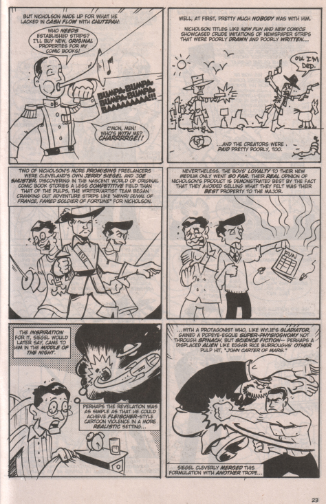
But scholarship quibbles aside, the major disappointment with book was just that it wasn't very good as comics. I couldn't see how presenting this in comics format added anything to to the telling: the creators don't really seem to be exploiting the form. On the contrary, most of the panels are merely non-sequential illustrations that "act out" the text without adding anything new to the communication. Take this page, which also includes the good major:
With the exception of the first panel, with its symbolic representation of Nicholson as a leader and where the word balloon dialog "Who's with me" is answered in the subsequent caption box, none of the illustrations adds anything to the text in any integral or creative way. Does the inclusion of a deliberately bad drawing in panel two really add to the description of the crude art found in early comics? Does a sketch of three swashbuckler types in panel three (two with Siegel and Shuster's faces) help us understand the description of strips like Henri Duval better? It would appear not.
There just seemed to be too much of this throughout the book. If I was just a little more OCD, I would type out all the caption boxes as straight text to see just how little editing it would take to turn the comic into prose. I'm betting very little.
So, as much as I enjoy reading about the history of comics, I'm not sure I'll be scooping up the floppies on this one. The trade may have to be part of my library just for the sake of completeness, but I'm afraid my enthusiasm for the project has dimmed.
And now, a little comicsy mystery:
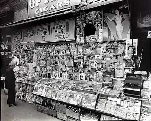
As I wander around the net, I often save images of people reading comic books and newsstands selling comic books, just for fun and personal use, like for computer wallpaper. Here's one that I found somewhere:
It seems to show a newsstand in early 1938, as you can see several copies of Action Comics #1 on the lower rack in the front right. Pretty cool piece of comics history, eh?
Well, it took a student of mine, who was looking on the net for a copy of this image after I showed it to the class as part of an exercise, to point me to this from the Museum of the City of New York:
Notice that the comics are gone, and with good reason: the photo was taken by Berenice Abbot in late 1935 - over two and a half years before Action was published.
Why would someone photoshop this picture?
Unfortunately, I haven't found a source for the doctored image yet. I'll let you know if and when I do, unless someone tells me first.
Until then, remember: document your sources!
Monday, May 26, 2008
An appropriate occassion for a return
I have been away for this blog for too long because [insert usual description of RL interference with blogging responsibilities here], but some synchronicity compels a few remarks.
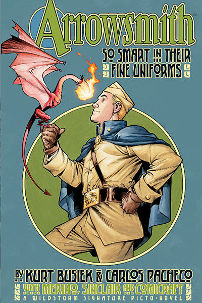
It had been a while since I have even bought a comic; I finally caught up with Comic Book Comics from Evil Twin and was very disappointed, but more on that later. But the other day I was in one of my LCS, and this cover caught my eye:
Arrowsmith: So Smart in their Fine Uniforms
Wildstorm: 2004
by Kurt Busiek, Carlos Pacheco, Jesus Merino, and Alex Sinclair
What caught my eye first was the sort of art nouveau design sensibility; as I leafed through the book, I could see that it was some sort of alternate history WW1 story, and something about it just hooked me. I took it home and read it over the next few days.
It turned out to be a well-done (if fairly typical) story of an idealistic young man who goes off to war for noble reasons and discovers that it is difficult to keep his moral stance in the middle of the horror of battle. The difference is that alongside traditional armaments, both sides use magic - sometimes nasty magic.
The book is beautifully drawn, the alternate world fully realized, and the characters engaging; the plot, however, could have been lifted from any of a number of war movies, and without much alteration would work just fine without any of the magical or other alternate history elements. Yet I feel the book is a worthwhile addition to the genre and well worth a read, for two reasons.
The first is that is is extremely well-done. Although the plot mechanics may be a little trite, Busiek's actualization of the trope is sophisticated and compelling. He makes us care about the characters and lets us feel their pain, their growth, their joys, and their losses. Within the fantasy realm, he paints as strong a picture of the realities of war as I think anyone could, and Pacheco's art more than meets the challenge of carrying the weight of the story. It is truly a tour de force for both creators.
Perhaps more importantly, the book called me to read it and to be open to its message. As jaded as I can be at times, I might not have read just another anti-war war book; I mean, there was All Quiet on the Western Front and Paths of Glory and Johnny Got His Gun and yeah, I've been there. But the alt-history pulled me in, and then the book slapped me in the face with a heaping dose of reality and made me think clearly again about about something incredibly significant, and made me feel again how I feel about it. And that is a good thing to have happen, and a nice achievement for any Art, whether fine, pop, or junk.
That this book made this statement to me on this particular weekend just made it all the more meaningful.
I guess Arrowsmith may be old news to some, but it was a new discovery to me; I suggest you check it out if you ever have the chance.
Sunday, April 20, 2008
Just a mention or two
I'm on a road trip this weekend, so no real post, but...
I caught a glimpse of the rough Spirit trailer. I have been not terribly interested (and even less optimistic) about this movie from the get-go, and this hasn't changed my mind. I have a feeling the film will fall into the great bin that holds Billy Zane's Phantom and Alex Baldwin's Shadow movies.
This poster doesn't seem to be creating too much of a kerfuffle, certainly compared to the dread MJ statuette and some covers; there's a graduate paper in image analysis for someone there.
Saturday, April 12, 2008
A beautiful Saturday!
Today was the best day of the year here in Seattle, sunny all day with temperatures that must have hit seventy. The lakes were filled with boaters, parks were crowded with ballplayers and runners, the Dalai Lama was making an appearance this afternoon at a program at the football stadium, and there was a green technology fair at the convention center.
So, of course, I spent the shank of the afternoon in a dark room at class on writing comics.
Class Act
Shary Flenniken, whom you may remember from her strip "Trots and Bonnie" in the old National Lampoon, was teaching a class called Scripting the Graphic Novel for Writers and Artists at the Richard Hugo House, a local center for the literary arts. The class was scheduled to coincide with Marjane Satrapi's appearance in town on Monday.
I had been expecting a class focusing on the details of full-script versus "Marvel" methods and similar technical issues. I guess this betrays my formalist bent; Shary's presentation, well-received by the eleven attendees, ranged from creativity exercises and brainstorming methods to scriptwriting practices and publishing concerns.
Most of the students were writers first and foremost; some of them had had little or no exposure to comics. More than one was looking for the appropriate vehicle for her story, or another way of telling it, after having tried prose and screenplay. There was a strong creative energy in the class and a great deal of respect for the promise of the "graphic novel" form.
Shary provided guidance in visual- and action-based writing that was on-target for the audience and the context. And she told funny stories, too!
check out Shary's website
A is A
There's a huge announcement bouncing around the internets right now:
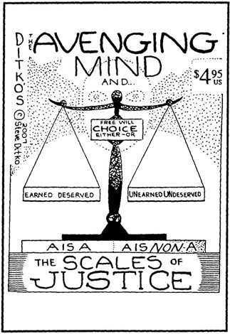
It looks like at long last Steve Ditko is going to have a new book coming out. I'm sure I'm going to get it, and I'm sure I will be thrilled to see new art from one of the greats, but I'm not as sure that I'm going to enjoy reading it. We'll see. Check out the details on Ditko Looked Up.
Monday, April 07, 2008
Interim linkage
Here are a few pieces from my recent bookmarks file:
The First Second feature Mentor's Corner has had some great essays on the structure and function of comics: Steven Seagle on Beginning-Middle-End and Calistra Brill on Time caught my attention in particular. These approaches provide a contrast to Neil Cohn's psycholinguistic investigations, which drive me crazy (but which I always read).
And speaking of alternate perspectives, it was interesting to find a fairly comprehensive overview of comics history on a marketing job search website.
A new journal, Graphoscope, should soon be joining the ongoing conversation, although I am always made a bit chary by the overuse of the word "criticism."
Just for fun, The Daily Batman is self-explanatory. I wonder how long it can go before it gets dull.
This weekend, I am passing up the Dalai Lama for Shary Flenniken - I'll tell you all about it.
Sunday, March 23, 2008
So, what of this, if anything?
I was listening to NPR this morning and they had a short feature on Toby Barlow's new book, Sharp Teeth, a contemporary werewolf story written in free verse. I was only half-listening, and heard some references to Homer and whatnot, but then caught Barlow describing his book as a "graphic novel without pictures."
Hunh?
The NPR website lists the full quotation: "a ripping yarn with the extra words ripped away ... a graphic novel without the pictures, or a hard boiled novel that's been boiled down to a reduction sauce."
As Jude Law said in I Heart Huckabee's: wait, what does that even mean?
Isn't the essence of comics (and hence, graphic novels) something about the words and pictures working together to carry the narrative? Or just pictures, when there are no words? The excerpt I read looked more like an epic poem than anything anything else. Isn't poetry already distilled language, concentrated imagery, that conveys more with less? Does this metaphor really add any depth to the description that calling it poetry doesn't?
I don't think so. And I think there might be another reason behind its use. Googling the phrase only garners two hits: in a review of Richard Morgan's first novel, the science fiction story Altered Carbon and in a review of comics writer Warren Ellis's first prose book, the gonzo detective novel Crooked Little Vein. In addition, Barlow's book itself sports this blurb from Scott Smith: "If Ovid had been raised on a steady diet of Marvel Comics, Roger Corman, and MTV, he might have written something like Toby Barlow's Sharp Teeth." All this seems to indicate to me that something else is going on.
I think this metaphor is the highbrow marker for confusing form with genre when thinking or talking about comics. I don't think any of the three uses of this metaphor - even by the author himself - really indicates anything about the narrative structure or energy of the text; I think they're shorthand (or code) for saying something about the book's content and its relative value or merit, the same way an action film might be accused of having a "comic book plot."
I'm not sure how I feel about that, but I think it is what's happening.
Update - full disclosure:
Re-reading this post today, I realized I had only searched for "graphic novel without pictures." However, a search for "graphic novel without the pictures" (that ignores Sharp Teeth references) only nets a few more results:
In a parent's guide to children's books discussing Quantum Prophecy, described in brief as "Comic-book style superhero action; moral dilemmas, some driven by visions of the future."
In a review of An Alchemist with One Eye on Fire, a collection of poetry described as having "cartoon-like imagery."
In a customer review on Amazon of The Doomsday Brunette, a book about "genetically engineered superwomen."
In a customer review on B&N of The Traveler, in which the book's action sequences are compared to Kill Bill and V for Vendetta.
In a personal remembrance of having read Nine Princes in Amber by Roger Zelazny over thirty years before.
All of these seem to support my initial response.
There was one different take. In a blog review of The Plot to Save Socrates, the reviewer notes the author's spare writing and lack of descriptions, and uses the graphic novel metaphor as negative criticism.
So, is this a mostly useless little phrase, then?
Wednesday, March 19, 2008
Sad sack
So, I was sitting around in a local corporate coffeeshop, thinking about my missed post from last weekend and wondering if I wanted to have a strack, squared-away blog like The Fortress of Fortitude, with regular features and timely posts (and excellent writing), or a casual, whenever-the-spirit-moves-me blog, like Estoreal (with its excellent writing).
The spirit hasn't moved me much this week, that's for sure: Arthur C. Clarke died; he was a particular hero of mine, and his passing genuinely saddened me.
There were other, minor, more transitory sadnesses. I missed Comic Book Comics #1 when it came out, and my LCS still hasn't received their re-order.
I signed up to take a comics scripting class taught by Shary Flenniken at the Richard Hugo House, but there's only two of us registered (I think the other person is David Lasky) so it may not go.
And I went on the internets today to read my regular blogfeeds and found two bloggers, both of whom I enjoy reading, engaged in yet another comicsweblogosphere pissing match, the likes of which I think we have too much of already.
So, even though I am posting late, and even though I have not even made up my mind what this blog will be, all it is today is this:
Sunday, March 09, 2008
80pg. Giant
Twelve-step review:
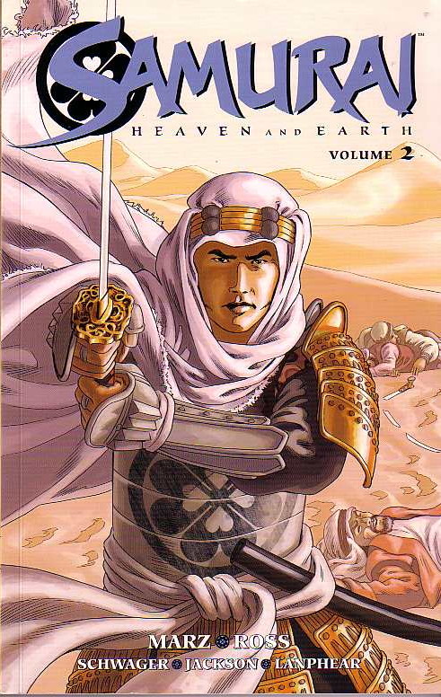
Samurai: Heaven and Earth - Volume 2
by Ron Marz, Luke Ross, Rob Schwager, Dan Jackson, and Dave Lanphear
Dark Horse: 2007
1. Our story continues the adventures of Shiro, a misplaced samurai fighting his way across early eighteenth century Europe in search of his lost love, Yoshi. In this arc, Shiro makes his way though Spain, across the Mediterranean, and then across North Africa from Tripoli to Egypt.
2. Shiro picks up an ally of sorts on his journey: the Arab slaver who initially brought Yoshi from her captivity in China to Europe. They even get a "meet cute" moment:
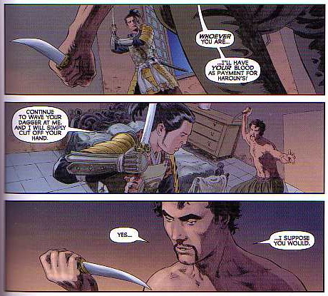
3. Shiro's partnership with Al-Din and his need of the trader's local knowledge and contacts serve to somewhat mitigate the sometimes omnipotent nature of the character. There seems to be no army that Shiro cannot defeat singlehandedly; I wanted to see him succeed more by guile or determination or experience and less by just being better than everyone else.
4. Marz's script now include flashbacks to Japan at the start of every chapter. I think that this device works even more effectively in the collection as it would have in individual issues; the two "stories" merge nicely at the end of the book. Notwithstanding Shiro's unstoppability, Marz paces the quest and cliffhangers that appear throughout the plot well.
5. Don Miguel, the duplicitous Spanish ambassador from the first book, is developed further as a villain of major standing, and Yoshi is given more time of her own to shine.
6. The language issue that I mentioned in my review of the first book is given minor attention, but is still never really addressed. That's still okay.
7. The issue of Yoshi's sexual experiences while in captivity, on the other hand, is addressed directly, forthrightly, and in a sophisticated adult manner. Kudos.
8. Luke Ross's art is still totally gorgeous. The shift in setting to North Africa allows him to indulge himself in a whole different collection of set pieces and determining shots. Somebody referred to this part of the series as Shiro of Arabia, and it has the same epic sweep as the David Lean film. The people are still beautiful to look at as well.
9. In addition to the flashbacks mentioned above there is another device that I think works better - or only - in the collection. Page six of chapter one (a full-page spread) is perfectively and effectively echoed on page eight of chapter five. I'm not sure this would have been as compelling if I had seen the images four months apart rather than less than an hour. (It is precisely this kind of effect that the form of the physical text has on narrative that I might use as my research focus for my doctorate.)
10. The book contains another great slew of bonus features: design sketches, unused cover concepts and a gallery of the characters by different artists.
11. The most interesting feature in the extras will be incorporated into my class on comics nd sequential art next quarter: Ross penciled one fight scene as a two-page spread, and then had to re-arrange the panels when he realized the scene would actually fall on the recto and verso of the same page. It is a great example of the interplay of narrative, art, panel design, and page layout in comics.
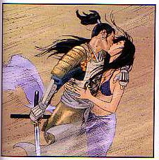
12. I don't think it's too much of a spoiler to let you know that the lovers are re-united - at least for a time: there are clearly more struggles ahead and another five-issue arc is promised. I'll sure be waiting for the trade.
Not a review
I picked up a copy of Fantastic Four: The Lost Adventure #1. This book, billed as a Stan Lee/Jack Kirby production, takes an unpublished story by Stan and Jack and presents it three ways: as reproductions of the original pencils, complete with marginal notes; within a different published story that used some of the panels and pages - out of context - as a flashback sequence; and as the complete story as it was originally intended to be seen back in 1970, with post facto production assistance from contemporary professionals. I find this a wonderful piece of work, if only for its glimpse into the creative and productive processes that go into a comic book. This will be another text for the class to consider.
Five-star review:
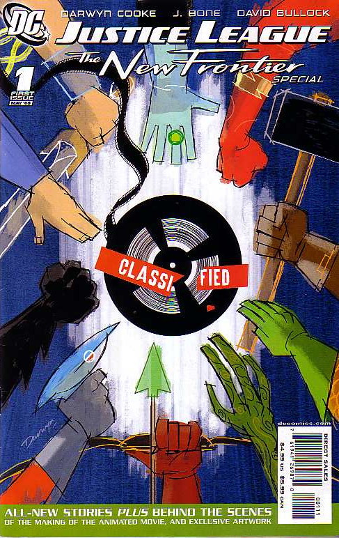
Justice League: The new Frontier Special #1
by Darwyn Cooke, J. Bone, and David Bullock
1. This is not so much a review as a love letter. Darwyn Cooke just gets superheroes better than anyone else at DC and has a design sensibility and visual elan than I just can't get enough of.
2. Cooke's fight between Superman and Batman in the main story makes you realize just how silly and self-indulgent Frank Miller can be, and was even back in The Dark Knight Returns. Cooke, on the other hand, provides a slam-bang action story without sacrificing any character consistency. Cool beans, indeed.
3. I grow more and more in love with Cooke's Wonder Woman. Man-o-man, wotta woman!
4. The Robin and Kid Flash team-up tale was everything that I had hoped The Teen Titans Lost Annual was going to be, and wasn't. Haney's magic didn't survive him, and that post-mortem concoction just fell flat. This story, however, is an hommage, not a reproduction, and it positively zings; can you dig it, daddy-o?
5. The rest of the issue was full of more fun: a pitch-perfect Rip Hunter intro; a frothy, funny Wonder Woman-Black Canary-Gloria Steinem (!) team-up; some behind the scenes art from the New Frontier DVD; and the hidden jewel of the piece: a National Comics in-house ad from an Elseworld where John Henry and Martian Manhunter had their own ten-cent comics alongside Green Lantern.
Compare and contrast
I went to see the Persepolis movie today.
Y'know, I have to say that I was never a big fan of the book. It was the Seattle Public Library's "Everybody Reads" pick a few years back, and I even gave a talk on "How to Read a Graphic Novel" in conjunction with that event that used the memoir as its centerpiece, but I never really thought it was that good. Marjane Satrapi clearly has a compelling story to tell; I just don't think that she is that accomplished as a storyteller. The book doesn't really exploit the potential of the form, the art doesn't captivate me, and the story seems to just chug along without much momentum. Maybe I'm missing something, but I never quite got what all the fuss was about.
The film, on the other hand, has some magical moments, is beautifully visualized, and has condensed the story into a tighter narrative arc that moves briskly. It was not a great film, but surely a good one. When I came home, I took another look at the books, and realized that the parts that seemed to work the best for me on the screen were those parts that deviated the most from Satrapi's original vision on the page. I don't know if she just had wonderful collaborators or if film is her true medium, but the movie is so much better than the comic that it is hard to figure out. I'll have to give this a lot more thought (and maybe ask my students!).
Meta
It seems this little corner of the blogoverse must have passed some sort of threshold, because I am starting to get some solicitations for reviews, which has never happened before. This really isn't primarily a "new stuff" blog, so I don't think I'll be going that way, but I wanted to share a piece of the latest request I got, verbatim:
I was wondering if you would be interested in reading it and perhaps giving it a review on your "internet web-log."
So, is that the subtlest irony ever or genuine?
Labels:
graphic books,
new comics,
not comics,
self-referential
Saturday, March 01, 2008
Twelve-step review (with bonus video): Justice League: The New Frontier
So, true to their word, the fine folks at M80 sent me a preview copy of the new Justice League: The New Frontier DVD to review. (It didn't look anything like the image to the left; the package was different and there was only one disk. I think I might have the Brazilian version, since the alternate language is Portuguese. )
I decided to try something a little different and invite five friends over to watch the movie and offer their comments. We have a wide range of perspectives represented, from an old-school comics fan who has read the New Frontier comics to someone who is not a comics fan and hasn't ever laid eyes on the original story; their relative exposure to the genre and the story are reflected in their "scores" on the video. Check it out and see for yourself. (Oh, yeah, and I guess there's a spoiler alert for this whole thing._
As for my take on it:
1. For the record, I loved the original. It spoke to my personal experiences and coming-of-age and had a design sensibility that I enjoyed, as well as presenting what I thought was pretty good story even without all the insider stuff.
2. The video does a pretty good job of telescoping the plot down to a manageable level; some history and some characters are sacrificed, but it would have been unwieldy otherwise.
3. The condensation of the plot reduces minor roles to cameo appearances: Mlle. Marie makes a few brief appearances and has one line; the Challengers of the Unknown are never named and appear solely as purple jumpsuits walking on a dead pterodactyl; the Blackhawks glower and shout "Hawk-aaa," but that's about it; and Green Arrow doesn't even get any lines.
4. The upshot of this characterization shorthand is that the viewer only gets it if they already got it; some of the best throwaway bits are wasted on the non-fan. It seems this would limit the movie's potential audience.
5. The movie also reveals that superhero dialog that works great on the page is often not as impressive when acted out. Batman's "penny for a book of matches" line and Farady's "real men wear pants" are two good examples.
6. Darwyn Cooke's retro design sense clearly informed the art, but there was still a little too much of a Diniverse vibe to it for me. In addition, there was too much Burns-effect panning across still images.
7. In particular, the backgrounds felt awfully skimpy sometimes. The Las Vegas sequence is a great example of this; it started out strong visually, but then got a bit sketchy as it went on.
8. Other visual bits suffered the same shorthand-itis as the characterization. Details like changes to Batman's costume are lost on non-fans without any explanation.
9. The Martian Manhunter arc was very sturdily constructed and made perhaps the best sense of J'onn's origin ever; it clearly establishes the character as, if not the first hero of the Silver Age, the critical bridge between the ages. (With just a wee bit of script doctoring, this could be a Martian Manhunter movie.)
10. The Hal Jordan arc seemed less integrated and not as tightly written; Barry Allen and Iris West are delightful. The Trinity all represent well, with Diana a bit feistier than she is often portrayed - and taller than Superman!
11. The devil is in the details, and some worked better than others: the cameo by Kennedy was a bit lame, but seeing Lex in a fifties-era "Lexco" office was brilliant.
12. Overall, I wish the movie had had twice the budget and been half-again as long. With a little boost in production values and a bit more time to spin the story, The New Frontier could have been as mainstream as a superhero movie could get; as it is, it's a nice diversion for fans.
Saturday, February 23, 2008
Promotional interlude
Well, I still haven't had much time for reading or any real writing - I just yesterday managed to pick up Diana Prince: Wonder Woman Volume One, but aside from flipping through it and briefly grooving on the psychedelic Sekowsky artwork and ultra-mod O'Neil scripts, I haven't been able to really dive into it. Nonetheless, there are a few news items to share!
Sort-of comics
The New Frontier DVD is coming out soon and I was contacted by M80, the outfit that is promoting this for Warner, and asked to spread the word. Not much of a stretch, since the comic itself is one of my favorites, especially since it features a lot of cool J'onn Jo'nzz action. Here's the official line on the film:
Justice League / The New Frontier
Inspired by the best-selling graphic novel by Darwyn Cooke and produced by the multiple Emmy® award winning animation legend, Bruce Timm, The New Frontier is the epic tale of the founding of the Justice League. Superman, Batman and Wonder Woman are all here of course, and so are Green Lantern, Martian Manhunter and Flash - whose incredible origins will be told for the very first time. Strangers at first, these very different heroes must overcome fear and suspicion to forge an alliance against a monster so formidable, even the mighty Superman can not stop it. If they fail, our entire planet will be “cleansed” of humanity.
I find it interesting that the movie is being touted as a "Justice League" movie, although I expect that this is both an attempt to connect to the general public and a bit of a lead-in to the upcoming(?) live-action movie. It also might just be an attempt to counter the pretty heavy nostalgia factor of the book and connect to a wider comics audience as well. A fellow comics fan, a generation younger than me, liked New Frontier, but didn't appreciate it as much as I did; he was a bit puzzled by what he called "all the Green Lantern love" that it contained. In any case, I'm looking forward to the DVD, if for nothing else besides the animated version of one of the best characterizations of Wonder Woman ever:
If I get a preview DVD, I'll have a little premiere party and let you know what a cross-section of folks say. And if you want more info now, check out the official New Frontier website.
Not comics at all, really
A pal of mine, Yojimbo 5, has launched a new movie review blog, Let's Not Talk About Movies. Yojimbo is a good friend of this site and no comics slouch himself, so if you're in the mood for some thoughtful commentary on movies old or new, head over there. Hey, I'll bet I can get him to review The New Frontier...
Comics scholarship
It has been a pretty busy year in the classroom: in addition to a new tenure-track position at a local community college, I have been working out a prior contract as associate faculty at a local university, so I essentially have been teaching an overload all the time. As a present to myself, Spring will be my All-Comics Quarter.
At the university, I am teaching Comics and Graphic Novels: Literary Technique in Sequential Art, a class that I have been developing for about a year. Here's the course description:
Comics in America represent a long history of artistic experimentation and expression in their development from escapist newspaper comic strips to contemporary graphic novels addressing complex themes. As it evolved, the form has developed a rich repertoire of conventions and techniques for story-telling. In this course, students will become familiar with the formal literary qualities present in comics as well as the semiotic principles immanent in pictorial narratives. Students will be able to identify and understand the structure and application of elements such as panel arrangement and design for pacing and mood; “camera angles” as expressions of time, space, and emotion; word balloon and caption types and their particular uses; sound effects and other out-of-balloon texts; narrative arcs/traditional themes; and common script preparation processes. The course is not an art class in the traditional sense of learning drawing techniques, anatomy, or perspective; rather, it explores the requirements, expectations, and particular strengths and weaknesses of the form.
We'll be reading Scott McCloud's Understanding Comics; The Language of Comics, a collection of academic essays; Paul Chadwick's Concrete (Volume 1: Depths); Jar of Fools by Jason Lutes; Kazu Kibuishi's Daisy Kutter; and the great Alison Bechtel's great Fun Home.
At the community college, I have two sections of Writing from Research (English 102); our general theme will be twentieth century popular culture and our model text will be Bradford Wright's Comic Book Nation: The Transformation of Youth Culture in America. I also have a section of College Composition (English 101), so I decided to shoot the moon and use graphic books as the texts for that class, too: Maus, Palestine, Contract with God, and Persepolis.
I have used comics to a greater or lesser degree in my English classes several times before, but haven't yet had the chance to teach comics-as-literature, so this will be fun. If you're in the Seattle area and interested in details, let me know and I'll fill you in.
Next week: maybe I'll actually read a comic book!
Monday, February 18, 2008
Pirate vs. Ninja!
That's right - I said
One of the most proliferant memes on the internets, Pirate versus Ninja is high concept at its highest, a pop culture mash-up cum personality test that is more exciting than anything since the Captain Midnight-Spy Smasher crossover of 1943 and a heckuva lot more fun than a Myers-Briggs assessment.
And now, thanks to assiduous research a lucky Google hit, I believe I have uncovered the ur-document, the prime source, the unmoved mover of the whole megillah.
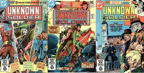
Unknown Soldier #254 - 256, August - Oct0ber 1981; DC Comics
Captain Fear by Dave Micheline, Walter Simonson, John Workman, and Carl Gafford.
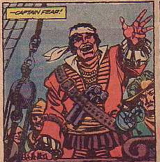
Captain Fear was an 18th-century Pirate of the Caribbean with a twist. Beginning his career in Adventure Comics in 1973, he was a Carib Indian and leader of the indigenous people in the region who becomes a pirate and taunts and twits the Spanish hegemon much like Zorro in California (except that as an actual member of the oppressed people, instead of merely their champion, he gets to keep the booty for himself).
The good captain sailed around the periphery of the DC universe on a course so eccentric he was revived (with a distinctly Ricky Martin vibe) in Architecture & Morality along with other D-list characters representing The Obscure. Back in the summer of 1981, he had found a temporary home in the war title Unknown Soldier, competing for his six or seven pages with Dateline: Frontline (tales of a war correspondent) and miscellaneous non-serial fillers. His stories didn't even get titles, but this three-parter is significant for its ground-breaking theme.
A splash-page prelude establishes some sort of connection between the Battle of Sekigahara in Japan in 1600, the European War of Austrian Succession begun in 1741, and a 1748 confrontation between a Spanish warship and strangely unresponsive Dutch freighter. Fear and his crew of buccaneers interrupt the standoff, seizing the Spanish ship and taking the Dutch ship as their own prize.
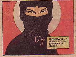
Upon boarding the East India trading ship, they find the entire crew slain, by mysterious star-shaped weapons. Fear finds what he believes to be something of value - a scroll, apparently being guarded by a "yellow man." Fear takes the scroll and other booty and leaves a skeleton crew to guard the ship: sailors who are doomed, because the unseen assassin cuts them all down before revealing himself to the reader in this dramatic shot:
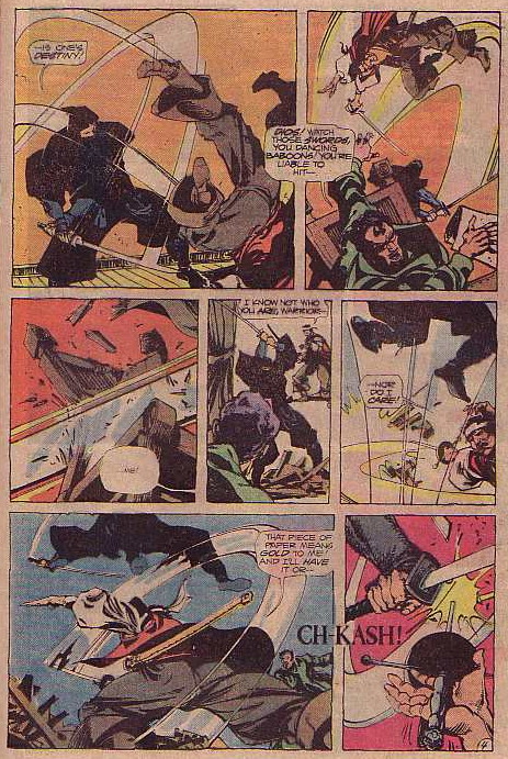
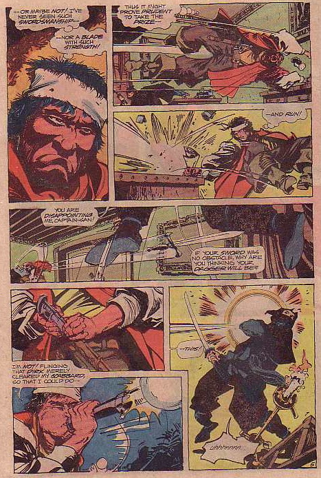
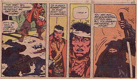
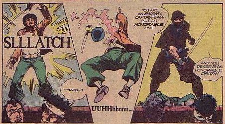
In the next installment, Fear takes the scroll, in the middle of the night, to the governor of the island of San Bastienne and, at swordpoint, forces the Spaniard to read it to him. (Why he didn't just find someone friendly is not explained - literacy must have been rare in those parts). The governor soon realizes the document is a "communique between dissident factions in Japan and the King of England" about a possible alliance. Realizing the value of the document in Europe, he offers to buy it from Fear, but their negotiations are interrupted by the ninja, who has tracked the scroll across the world for the Shogun and is sworn to retrieve it. What follows, is, of course, pirate versus ninja, presented here in all its muddy, mando-paper glory:
Ah, if only they had continued to fight until a clear winner was determined - the internets might have been spared so manypointless interesting arguments! But, alas, the governor's guards burst in at that moment, scattering the opponents.
The final chapter begins with two vessels, one piratical and one gubernatorial, moored together so Captain Fear and Governor Luis Castelone (who now has a name) can swap scroll for gold. Of course, the unscrupulous Spaniard attempts a double-cross, but Fear's life is saved - for the moment - by the ninja! Oh, how ironic!
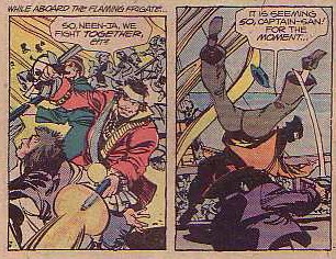
It all goes south from there, as the governor's reinforcements arrive, Fear sets fire to the two ships with a pre-arranged booby-trap, and a melee breaks out in which the captain-san and the neen-ja find themselves on the same side. Oh, irony redux!
You can probably write the rest of this yourself: ninja is killed, Fear avenges his death by killing the governor, Fear gets his gold and leaves the scroll with the ninja on the burning ship, so the ninja can die having completed his mission for his master. Ah, the Bronze Age.
So, there you have it, perhaps the original Pirate vs. Ninja: pre-YouTube, pre-internet, pre-COIE even.
And the world would never be the same.
Notes:
1. The (clear) covers were skimmed from GCD, as usual. The (crappy) interior scans are from the actual comics, now in the LSB.
2. That whole story took eighteen pages - and that includes the beginning-of-chapter recaps!
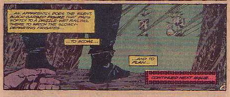
3. The best sound effect in the story is not that "SLLLATCH" of a ninja sword slicing a Spanish sailor, but actually the "SHRATCHAFOOM" of a pitch-and-kerosene soaked frigate exploding into flame.
4. Now that I think of it, we see the ninja shot by a volley gun and left on a burning ship, but never actually get his death confirmed. Perhaps we underestimate... a ninja! Maybe there's an even more obscure character waiting to be revived, eh?
Pirate!
versus
Ninja!
versus
Ninja!
One of the most proliferant memes on the internets, Pirate versus Ninja is high concept at its highest, a pop culture mash-up cum personality test that is more exciting than anything since the Captain Midnight-Spy Smasher crossover of 1943 and a heckuva lot more fun than a Myers-Briggs assessment.
And now, thanks to
Unknown Soldier #254 - 256, August - Oct0ber 1981; DC Comics
Captain Fear by Dave Micheline, Walter Simonson, John Workman, and Carl Gafford.
Captain Fear was an 18th-century Pirate of the Caribbean with a twist. Beginning his career in Adventure Comics in 1973, he was a Carib Indian and leader of the indigenous people in the region who becomes a pirate and taunts and twits the Spanish hegemon much like Zorro in California (except that as an actual member of the oppressed people, instead of merely their champion, he gets to keep the booty for himself).
The good captain sailed around the periphery of the DC universe on a course so eccentric he was revived (with a distinctly Ricky Martin vibe) in Architecture & Morality along with other D-list characters representing The Obscure. Back in the summer of 1981, he had found a temporary home in the war title Unknown Soldier, competing for his six or seven pages with Dateline: Frontline (tales of a war correspondent) and miscellaneous non-serial fillers. His stories didn't even get titles, but this three-parter is significant for its ground-breaking theme.
A splash-page prelude establishes some sort of connection between the Battle of Sekigahara in Japan in 1600, the European War of Austrian Succession begun in 1741, and a 1748 confrontation between a Spanish warship and strangely unresponsive Dutch freighter. Fear and his crew of buccaneers interrupt the standoff, seizing the Spanish ship and taking the Dutch ship as their own prize.
Upon boarding the East India trading ship, they find the entire crew slain, by mysterious star-shaped weapons. Fear finds what he believes to be something of value - a scroll, apparently being guarded by a "yellow man." Fear takes the scroll and other booty and leaves a skeleton crew to guard the ship: sailors who are doomed, because the unseen assassin cuts them all down before revealing himself to the reader in this dramatic shot:
In the next installment, Fear takes the scroll, in the middle of the night, to the governor of the island of San Bastienne and, at swordpoint, forces the Spaniard to read it to him. (Why he didn't just find someone friendly is not explained - literacy must have been rare in those parts). The governor soon realizes the document is a "communique between dissident factions in Japan and the King of England" about a possible alliance. Realizing the value of the document in Europe, he offers to buy it from Fear, but their negotiations are interrupted by the ninja, who has tracked the scroll across the world for the Shogun and is sworn to retrieve it. What follows, is, of course, pirate versus ninja, presented here in all its muddy, mando-paper glory:
Ah, if only they had continued to fight until a clear winner was determined - the internets might have been spared so many
The final chapter begins with two vessels, one piratical and one gubernatorial, moored together so Captain Fear and Governor Luis Castelone (who now has a name) can swap scroll for gold. Of course, the unscrupulous Spaniard attempts a double-cross, but Fear's life is saved - for the moment - by the ninja! Oh, how ironic!
It all goes south from there, as the governor's reinforcements arrive, Fear sets fire to the two ships with a pre-arranged booby-trap, and a melee breaks out in which the captain-san and the neen-ja find themselves on the same side. Oh, irony redux!
You can probably write the rest of this yourself: ninja is killed, Fear avenges his death by killing the governor, Fear gets his gold and leaves the scroll with the ninja on the burning ship, so the ninja can die having completed his mission for his master. Ah, the Bronze Age.
So, there you have it, perhaps the original Pirate vs. Ninja: pre-YouTube, pre-internet, pre-COIE even.
And the world would never be the same.
Notes:
1. The (clear) covers were skimmed from GCD, as usual. The (crappy) interior scans are from the actual comics, now in the LSB.
2. That whole story took eighteen pages - and that includes the beginning-of-chapter recaps!
3. The best sound effect in the story is not that "SLLLATCH" of a ninja sword slicing a Spanish sailor, but actually the "SHRATCHAFOOM" of a pitch-and-kerosene soaked frigate exploding into flame.
4. Now that I think of it, we see the ninja shot by a volley gun and left on a burning ship, but never actually get his death confirmed. Perhaps we underestimate... a ninja! Maybe there's an even more obscure character waiting to be revived, eh?
Sunday, February 10, 2008
Reading an English translation of a French semiotic analysis of the medium of comics can be fun
I haven't posted this weekend because serious affairs of RL have intervened.
Here is a quotation from my latest bedside book, The System of Comics by Thierry Groensteen, translated by Bart Beaty and Nick Nguyen (University Press of Mississippi: 2007).
At the end of the day, what makes comics a language that cannot be confused with any other is, on the one hand, the simultaneous mobilization of the entirety of codes (visual and discursive) that constitute it, and, at the same time, the fact that none of these codes probably belongs purely to it, consequently specifying themselves when they apply to particular "subjects of expression," which is the drawing.
And that's just in the introduction! Sheesh!
Regular posting will hopefully resume soon.
Saturday, February 02, 2008
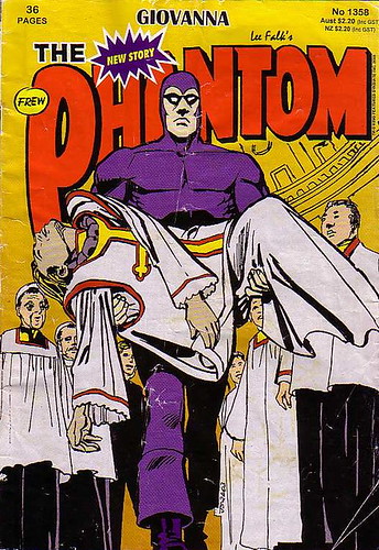
Twelve-step review: The Phantom: Giovanna
After the Comixtravaganza last week, I met my sweetie for dinner and a stop at the nearby Value Village thrift store. As she was checking out, I found this comic in a box that otherwise held a few miscellaneous Archies. I bought it for thirty-two cents, including sales tax.
The Phantom #1358 (2003)
Writer, Ingebjorg Berg Holm; Illustrator, Dick Giordano
Frew Publications: Sydney Australia
1. While we have been moving though our superheroic ages here in the U.S. of A, from silver age silliness to grim 'n' gritty, with our variant covers and reboots and serial first issues, this publisher in Australia has been quietly publishing a Phantom comic book without interruption since September 9, 1948.
2. Who knew Dick Giordano, one of the grand masters of American comic book art, was still cranking out the comics? His work here, while nothing flashy, shows his consummate craftsmanship and a deep understanding of the form.
3. From the ancillary material in the comic and sources on the web, it is clear that Frew Publications is the keeper of the flame for the extensive mythology surrounding Lee Falk's character: references to the canon and attempts to reconcile the character's 400-year in-story continuity and sixty-year publishing history demonstrate a real respect for the source material.
4. This particular story is an adventure of the fourth Phantom in the early 17th century, read by the current Phantom to his twin children, Kit and Heloise (whom I think I have seen in the newspaper strip). I believe this is a common framing device in Phantom stories.
5. The main story, set in Rome, actually concerns intrigues within the Catholic Church. Plots, politics, betrayals, torture, and poisonings are all portrayed unapologetically as business-as-usual in The Vatican.
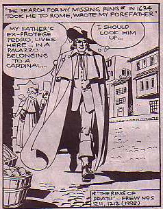
6. The Phantom gets involved in the story as he passes through Rome on a quest for his missing ring - the story of which appeared in the comic five years earlier, according to the editorial footnote.
Kit Walker rockin' the shades as his plainclothes disguise, seventeenth-century style.
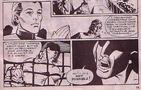
7. The Phantom not only finds himself drawn into the intrigues that killed his associate Pedro, but he finds himself strangely attracted to Cardinal Giovanni, with whom he suspects Pedro was having an affair. Here's The Ghost Who Walks confronting his own sexual confusion:
Don't fight the feeling...
8. Well, the cardinal is actually a woman after all! Giovanna and Pedro, young lovers, joined a monastery together to avoid being separated, managing to keep her sex a secret. They remained in the church and canoodled their way through the holy orders. Rather, Giovanni rose; Pedro was a bit of a late-renaissance slacker, and remained a monk (although he still got to snuggle a cardinal) until he was accidentally killed in a murder attempt on Giovanni.
9. The Phantom gets dragged deeper into the machinations within the church, and eventually he and Giovanna have an affair. While it's made clear to the reader what's going on with them, the current Phantom describes their first sexual tryst to the children as "Hmm... They... ehh... they embraced each other... for a long time." You'd think that a couple of kids being raised in the jungle to take over the mantle of a legend could handle a little sex.
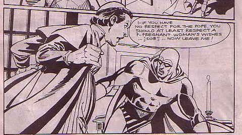
10. While The Phantom is off following a lead on his ring, Giovanna plots and murders her way into the papacy to prove to her lover that she is strong and capable enough to be his bride without hiding in Bengali. Her Machiavellian methods prove too much for The Phantom, and of course, it all comes to a bad end, but not before we get this totally surreal confrontation scene:
Wait, what?
11. The plot fulcrum for this story was based on the legend of Pope Joan, the apocryphal female pope of the ninth century, whose existence has been all but categorically disproved by historians, but who still holds a fascination for people: viz., this recent book and an upcoming movie with my own screen-crush Franka Potente.
12. In addition to the curiosity value of finding an Australian comic in a thrift store in Seattle and the serendipity of finding Giordano art inside, I was surprised at the relative maturity of the book. The sexual attraction between the characters, the cross-dressing and gender confusion, and the opportunistic and casual brutality of renaissance politics, not to mention the concern of the Church of Rome for matters of material wealth and power - all of these are portrayed frankly and openly, without any winks or nudges or hedging. I don't know who this Ingebjorg Holm is (and the internets didn't help any in finding out) buthe she writes a better comics story than a lot of the high-profile prose writers they tout so strongly in the spandex circle. Update: see comments.
Bonus: I just have to say that Fun Home might be the best graphic novel that I have ever read. I just got a copy this week, and I don't know what took me so long. Sometimes I am an idiot. As soon as I read this, I added it the syllabus for my class next quarter, Comics and Graphic Novels: Literary Technique in Sequential Art.
Don't be an idiot, too. If you haven't read this yet, do it now.
The Phantom #1358 (2003)
Writer, Ingebjorg Berg Holm; Illustrator, Dick Giordano
Frew Publications: Sydney Australia
1. While we have been moving though our superheroic ages here in the U.S. of A, from silver age silliness to grim 'n' gritty, with our variant covers and reboots and serial first issues, this publisher in Australia has been quietly publishing a Phantom comic book without interruption since September 9, 1948.
2. Who knew Dick Giordano, one of the grand masters of American comic book art, was still cranking out the comics? His work here, while nothing flashy, shows his consummate craftsmanship and a deep understanding of the form.
3. From the ancillary material in the comic and sources on the web, it is clear that Frew Publications is the keeper of the flame for the extensive mythology surrounding Lee Falk's character: references to the canon and attempts to reconcile the character's 400-year in-story continuity and sixty-year publishing history demonstrate a real respect for the source material.
4. This particular story is an adventure of the fourth Phantom in the early 17th century, read by the current Phantom to his twin children, Kit and Heloise (whom I think I have seen in the newspaper strip). I believe this is a common framing device in Phantom stories.
5. The main story, set in Rome, actually concerns intrigues within the Catholic Church. Plots, politics, betrayals, torture, and poisonings are all portrayed unapologetically as business-as-usual in The Vatican.
6. The Phantom gets involved in the story as he passes through Rome on a quest for his missing ring - the story of which appeared in the comic five years earlier, according to the editorial footnote.
Kit Walker rockin' the shades as his plainclothes disguise, seventeenth-century style.
7. The Phantom not only finds himself drawn into the intrigues that killed his associate Pedro, but he finds himself strangely attracted to Cardinal Giovanni, with whom he suspects Pedro was having an affair. Here's The Ghost Who Walks confronting his own sexual confusion:
Don't fight the feeling...
8. Well, the cardinal is actually a woman after all! Giovanna and Pedro, young lovers, joined a monastery together to avoid being separated, managing to keep her sex a secret. They remained in the church and canoodled their way through the holy orders. Rather, Giovanni rose; Pedro was a bit of a late-renaissance slacker, and remained a monk (although he still got to snuggle a cardinal) until he was accidentally killed in a murder attempt on Giovanni.
9. The Phantom gets dragged deeper into the machinations within the church, and eventually he and Giovanna have an affair. While it's made clear to the reader what's going on with them, the current Phantom describes their first sexual tryst to the children as "Hmm... They... ehh... they embraced each other... for a long time." You'd think that a couple of kids being raised in the jungle to take over the mantle of a legend could handle a little sex.
10. While The Phantom is off following a lead on his ring, Giovanna plots and murders her way into the papacy to prove to her lover that she is strong and capable enough to be his bride without hiding in Bengali. Her Machiavellian methods prove too much for The Phantom, and of course, it all comes to a bad end, but not before we get this totally surreal confrontation scene:
Wait, what?
11. The plot fulcrum for this story was based on the legend of Pope Joan, the apocryphal female pope of the ninth century, whose existence has been all but categorically disproved by historians, but who still holds a fascination for people: viz., this recent book and an upcoming movie with my own screen-crush Franka Potente.
12. In addition to the curiosity value of finding an Australian comic in a thrift store in Seattle and the serendipity of finding Giordano art inside, I was surprised at the relative maturity of the book. The sexual attraction between the characters, the cross-dressing and gender confusion, and the opportunistic and casual brutality of renaissance politics, not to mention the concern of the Church of Rome for matters of material wealth and power - all of these are portrayed frankly and openly, without any winks or nudges or hedging. I don't know who this Ingebjorg Holm is (and the internets didn't help any in finding out) but
Bonus: I just have to say that Fun Home might be the best graphic novel that I have ever read. I just got a copy this week, and I don't know what took me so long. Sometimes I am an idiot. As soon as I read this, I added it the syllabus for my class next quarter, Comics and Graphic Novels: Literary Technique in Sequential Art.
Don't be an idiot, too. If you haven't read this yet, do it now.
Saturday, January 26, 2008
SPL Comixtravaganza
Okay, so the good news is that I made it to the Comixtravaganza today (see below). The bad news is that I forgot my camera, so I have no pics to share. Here's a rundown anyway.
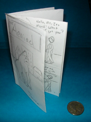
From 2pm to 3pm, David Lasky, creator of comics such as Urban Hipster, ran a workshop on creating minicomics. It was a great crowd - much bigger than the library had expected. Lasky gave a short presentation, showed us how to physically make a comic pamphlet from one sheet of paper, and then walked through his own storytelling process on a whiteboard while all the attendees made their own comics.
There were people of all ages and all attitudes in the audience - I was sitting with a tweener and mom who came with a six- or seven-year-old daughter, but I was far from the only greybeard in the house. And I think that was the most appealing thing about the session: it wasn't about breaking into the business, or professional techniques, or any of that; it was all about the joy of making comics for their own sake. Lasky obviously loves the form, and his affection comes through.
Here's my comic. I may post interior scans when I can.
And here's Lasky's website - but be warned: it has mystery meat navigation and doesn't seem to work too well.
From 3:30 to 4:15 pm, I attended a panel discussion on "the comics business." The panel comprised
Bill Barnes & Gene Ambaum, creators of Unshelved, the library-based webcomic. Artist Barnes is a lot like the character Dewey (snarky); Ambaum was the warm writer-type.
Greg Hatcher of Comic Book Resources. He played the crotchety old man for the panel (citing Adam West as his inspiration for getting into comics) and obviously loves the kids he teaches comic art to.
Nicole from NDP Comics, a how-to-draw-manga outfit. I didn't get a chance to ask her how she defined manga, especially in the context of this article.
Eric Reynolds, editor and PR guy from Fantagraphics Books (and a cartoonist in his own right). The embodiment of Seattle hipness, yet also very gracious.
Rosie Heffernan & Madeline Heffernan, creators of the webcomic Serves You Right. I gotta tell ya, their strip makes my head hurt, but these were two of the brightest and most poised high school students I have ever met.
The format of the panel was all Q&A; unfortunately, although the panelists tried their best with the As, the Qs didn't give them much to work with. It could have been so much more.
The finale of the event was a presentation by Seattle comics superstar Ellen Forney, she of Sherman Alexie collaboration fame. Forney is da bomb. She gave an overview of her creative process through examples of her work, all of which were beautiful to see. Besides having natural charisma, she is very comfortable working a crowd and knows how to organize and impart information (as well as being a rockstar cartoonist, she also teaches at a local art college). She closed with something that is close to a performance art piece; here's an early cut at it, but we got the big-screen version.
Forney's website is well worth a visit.
Overall, while not exactly an extravaganza, this was a solid comics event. The spearhead for legitimatizing comics in libraries has come in large part from the Young Adult librarians, and this was the case here. While this is laudable, it does skew the crowd young, changing the tenor of the event a bit. Still and all, a worthwhile way to spend a cold and rainy afternoon.
Oddly enough, on the bus to the library,
I was listening to the podcast of the "Comics are Not Literature" panel from the last Comic-con.
Obvious filler
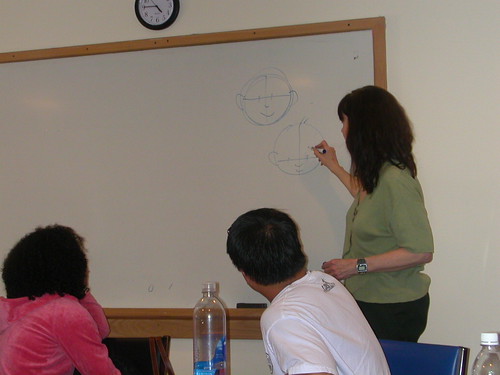
Man, this quarter has just taken off and gotten all kids of busy all of a sudden! There have been no posts for a while because I haven't had a chance to read or reflect on anything comics-related. (That on the right is a drawing of me that one of my students did on the board.)
I am taking a break from other responsibilties to attend this event today: The Comixtravaganza wrap-up at the Seattle Public Library. They have been celebrating comics all month, mostly with how-to sessions in the neighborhood branches aimed at younger audiences. This afternoon's spectacular at the Central Branch includes another how-to session with David Lasky; a panel discussion with some local comixerati; and a presentation from Ellen Forney. I will have a full report and see if I can get some pictures, maybe even by tonight.
Friday, January 11, 2008
A whale of a disappointment
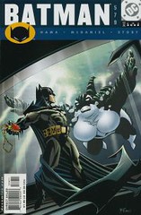
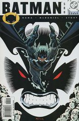
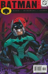
Some time ago when I was relatively new to the comixweblogosphere, I encountered Orca, probably at the Absorbascon. This whale-woman enemy of Batman had some great visuals and seemed like an intriguing and appealing character, so I immediately added her three-issue story arc to my back-issue buy list. Last week, I finally got around to buying and reading the issues.
Batman 579-581, July - September 2000
Written by Larry Hama & Scott McDaniel
Pencils by Scott McDaniel
Inks by Karl Story et al
Man, was I disappointed. Even going into this with low expectations, I didn't get near the level of fun I expected with Batman going up against a lady jewel thief with a more than passing resemblance to Shamu.
Some elements were pretty cool: Playboy-Bruce makes an appearance, and is given a nice combination of social responsibility and elitist smarm; Batman goes in disguise again, apparently as the "crazy vet" from Year One; Alfred gets to shine as the perfect factotum; and Orca is singularly impressive: a big hunk of a swimming, leaping, and ass-kicking woman.
Yeah, a lot of the pieces were there, but somehow the magic that pulls them all together never appears.
Part of the blame lies in the art. McDamiel's layouts are serviceable, and I like his penchant for horizontal panels, but his figure-drawing - anatomy, proportion, movement - looks more like sketches of supermarionation puppets than real people. Heads are too big, limbs bend at odd angles, people pose oddly. The deficiency shows up mostly in the civilians, but even Batman looks oddly deformed from time to time, and I found it a real distraction.
Without giving too much of a spoiler away (not that anyone who has read, oh, two or three comics before won't see it anyway), I was also sorry to see that Orca's real identity was not a plus-sized woman, but a typical, generically-body-typed woman. I really wanted to see a large lady presented as a strong, capable, powerful character - and I was imagining Orca as a bit of an anti-Selina Kyle in appearance and affect. But, no such luck.
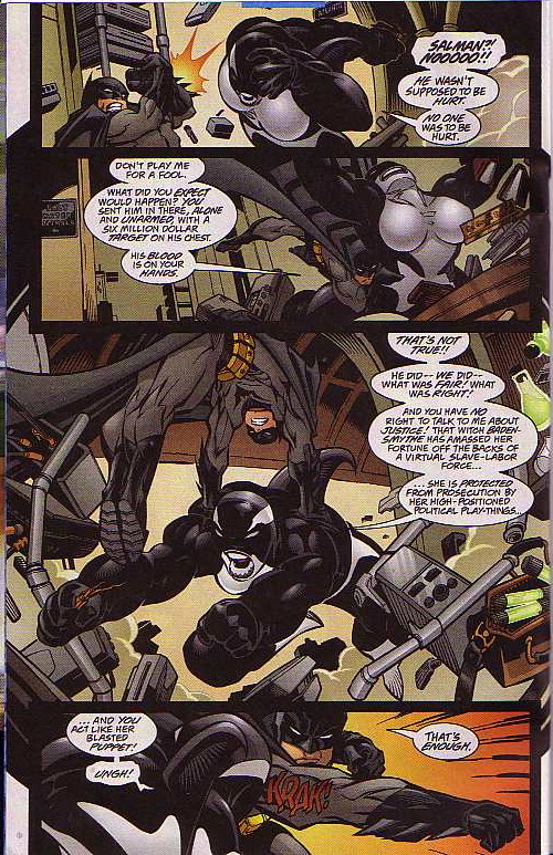
But the biggest fun-killer was the writers' choice of the central theme of the story. Y'see, Orca is a jewel thief with a heart of gold: she steals the "Flame of Persia" diamond fromLeona Helmsley Camille Baden-Smythe - right in front of Bruce Wayne - so that she can raise money for a soup kitchen-rehab facility-daycare center. Batman cannot countenance this felonious behavior, even for a good cause, and tracks Orca down relentlessly. In each of their encounters, Orca and Batman exchange philosophical sallies over the nature of moral relativity:
Hama & McDaniel really stack the deck. Baden-Smythe is a right rotter: disdaining "the hoi polloi" -and anyone else - to the extent of endangering lives to protect her jewel, bribing officials, throwing people out of their homes, terrorizing innocent people - all the usual behaviors of a robber baroness. The jewel that is stolen is of uncertain provenance and probably doesn't even belong to her. And yet Batman, even while being pilloried in the press as the puppet of the rich and losing the respect of Gotham's lower class, won't give a girl a break, and tracks Orca like she was the Joker or something.
It just didn't wash for me. I don't consider myself a strong proponent of situational ethics, but you can't convince me there isn't a difference, at least in degree if not in kind, between property theft and exploitation of humans. And you can't convince me Batman doesn't see that difference. Its not the theft of his mother's pearls he's been working himself up over all these years.
I can take Batman versus property criminals when it's a ripping yarn, a puzzle piece, and the real-world themes are left out. Or I can handle Batman going after thieves when they actually endanger the innocent; it's their violence he's responding to, not their redistribution of wealth. But if you try to make a socially-conscious jewel thief a major villain while bringing in real class and economic struggles - well, you've lost me.
What's worse is that the script tries to have its cake and eat it, too. In addition to hunting his killer-whale criminal, Batman also manages to take downMartha Stewart Baden-Smythe. Unfortunately, the writers have to use such implausible plot developments to do so (excuse me, but people like that do not actually handle the molotov cocktails they give to street urchins to toss at buildings) that it actually reinforces the feeling that the elite can literally get away with murder while lesser-ranked criminals get slammed.
Actually, the story is much more believable if we take Batman as an unreliable narrator: he really doesn't care morally about the theft of the jewel, he's just pissed that the crime happened right in front of him. With that motivation, his doggedness, if even less laudable, at least makes a lot more sense.
Oh well, at least with the return of the multiverse, I can imagine that somewhere there is a happy Orca, swimming her way through Gotham Harbor, stealing marine-themed baubles from waterfront museums - and occasionally a kiss from Batman.
Batman 579-581, July - September 2000
Written by Larry Hama & Scott McDaniel
Pencils by Scott McDaniel
Inks by Karl Story et al
Man, was I disappointed. Even going into this with low expectations, I didn't get near the level of fun I expected with Batman going up against a lady jewel thief with a more than passing resemblance to Shamu.
Some elements were pretty cool: Playboy-Bruce makes an appearance, and is given a nice combination of social responsibility and elitist smarm; Batman goes in disguise again, apparently as the "crazy vet" from Year One; Alfred gets to shine as the perfect factotum; and Orca is singularly impressive: a big hunk of a swimming, leaping, and ass-kicking woman.
Yeah, a lot of the pieces were there, but somehow the magic that pulls them all together never appears.
Part of the blame lies in the art. McDamiel's layouts are serviceable, and I like his penchant for horizontal panels, but his figure-drawing - anatomy, proportion, movement - looks more like sketches of supermarionation puppets than real people. Heads are too big, limbs bend at odd angles, people pose oddly. The deficiency shows up mostly in the civilians, but even Batman looks oddly deformed from time to time, and I found it a real distraction.
Without giving too much of a spoiler away (not that anyone who has read, oh, two or three comics before won't see it anyway), I was also sorry to see that Orca's real identity was not a plus-sized woman, but a typical, generically-body-typed woman. I really wanted to see a large lady presented as a strong, capable, powerful character - and I was imagining Orca as a bit of an anti-Selina Kyle in appearance and affect. But, no such luck.
But the biggest fun-killer was the writers' choice of the central theme of the story. Y'see, Orca is a jewel thief with a heart of gold: she steals the "Flame of Persia" diamond from
Hama & McDaniel really stack the deck. Baden-Smythe is a right rotter: disdaining "the hoi polloi" -and anyone else - to the extent of endangering lives to protect her jewel, bribing officials, throwing people out of their homes, terrorizing innocent people - all the usual behaviors of a robber baroness. The jewel that is stolen is of uncertain provenance and probably doesn't even belong to her. And yet Batman, even while being pilloried in the press as the puppet of the rich and losing the respect of Gotham's lower class, won't give a girl a break, and tracks Orca like she was the Joker or something.
It just didn't wash for me. I don't consider myself a strong proponent of situational ethics, but you can't convince me there isn't a difference, at least in degree if not in kind, between property theft and exploitation of humans. And you can't convince me Batman doesn't see that difference. Its not the theft of his mother's pearls he's been working himself up over all these years.
I can take Batman versus property criminals when it's a ripping yarn, a puzzle piece, and the real-world themes are left out. Or I can handle Batman going after thieves when they actually endanger the innocent; it's their violence he's responding to, not their redistribution of wealth. But if you try to make a socially-conscious jewel thief a major villain while bringing in real class and economic struggles - well, you've lost me.
What's worse is that the script tries to have its cake and eat it, too. In addition to hunting his killer-whale criminal, Batman also manages to take down
Actually, the story is much more believable if we take Batman as an unreliable narrator: he really doesn't care morally about the theft of the jewel, he's just pissed that the crime happened right in front of him. With that motivation, his doggedness, if even less laudable, at least makes a lot more sense.
Oh well, at least with the return of the multiverse, I can imagine that somewhere there is a happy Orca, swimming her way through Gotham Harbor, stealing marine-themed baubles from waterfront museums - and occasionally a kiss from Batman.
Subscribe to:
Posts (Atom)